Fintech eWallet Mobile App - Home Screen Design

Project description
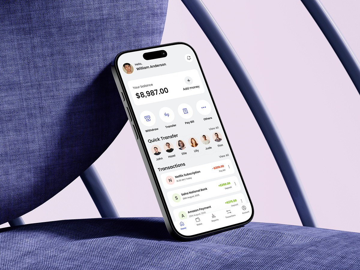
Designing a fintech eWallet home screen is not about showing features—it’s about reducing anxiety. When I started this design, my first question was simple: What does a user need to feel confident within the first 3 seconds? That insight shaped every decision. The balance is placed front and center, not buried, because financial clarity builds trust. Primary actions like Withdraw, Transfer, and Pay Bill are surfaced immediately to reduce cognitive load and eliminate hesitation. No scrolling, no guessing. Quick Transfer is intentionally visual. Faces over names reduce decision time and make money movement feel human rather than transactional. Transactions follow a clear hierarchy with color-coded feedback, helping users instantly understand money in vs money out without reading details. The challenge was balancing feature richness with simplicity. Fintech apps often overwhelm users. I focused on progressive disclosure—showing only what’s needed now, while keeping deeper actions accessible but secondary. This home screen isn’t just UI—it’s a confidence engine designed to help users act faster, with fewer errors, and more trust. What’s the first emotion your fintech product creates when users open it?
Support this project
Upvote