Fintech eWallet Mobile App - My Wallet Screen Design

Project description
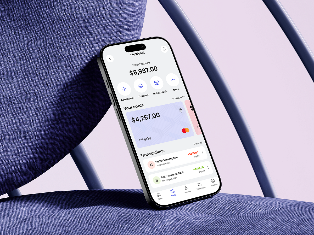
Designing a fintech My Wallet screen is about control, not decoration. For this screen, my core question was: how can users understand their financial position instantly, without mental effort? That’s why the total balance sits at the top—clear, prominent, and distraction-free. It answers the most important question first. Primary wallet actions like Add Money, Currency, Linked Cards, and More are grouped directly below the balance. These aren’t random placements—they reflect the most common wallet management behaviors and reduce navigation friction. The card section was designed to balance security and clarity. Showing partial card details and balance builds confidence without exposing sensitive information. Transactions follow a clean hierarchy, using color and spacing to communicate inflow vs outflow at a glance. The biggest challenge was managing information density. Wallet screens can quickly become overwhelming. I used visual grouping, spacing, and progressive disclosure to keep the experience calm while remaining scalable. This screen is designed to help users feel in control—before they take any action. What information do you think users expect to see first on a wallet screen?
Support this project
Upvote