Fintech eWallet Mobile App - Transactions Screen Design

Project description
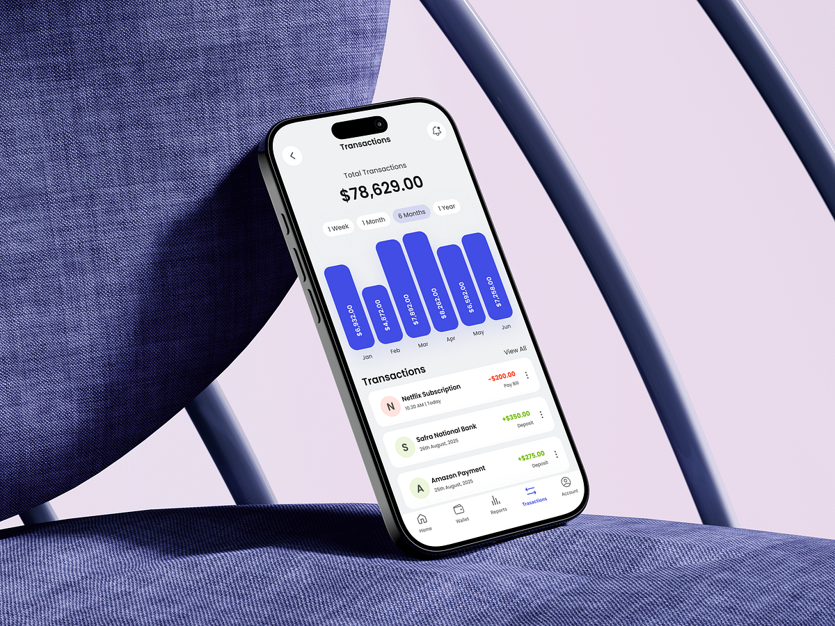
This Transactions screen was designed with one core principle in mind: financial clarity at a glance. In fintech products, users don’t explore—they verify. That insight shaped every design decision here. I placed the total transaction value at the top to immediately answer the most important question: How much activity happened in this period? The time filters (week, month, 6 months, year) allow quick comparisons without forcing users into complex charts or settings. The bar chart is intentionally simple—clear bars, consistent color, and readable values—to communicate trends without cognitive overload. The transaction list focuses on recognition, not recall. Clear merchant names, subtle icons, and color-coded amounts help users instantly differentiate deposits from expenses. Spacing and hierarchy reduce visual noise, making the screen scannable even in rushed moments. The challenge wasn’t adding more insights—it was removing friction while keeping meaning. This screen is built for confidence, speed, and trust, not decoration. What’s the minimum information a transactions screen needs to feel truly trustworthy?
Support this project
Upvote