Grocery Delivery Mobile App - Home Screen Design

Project description
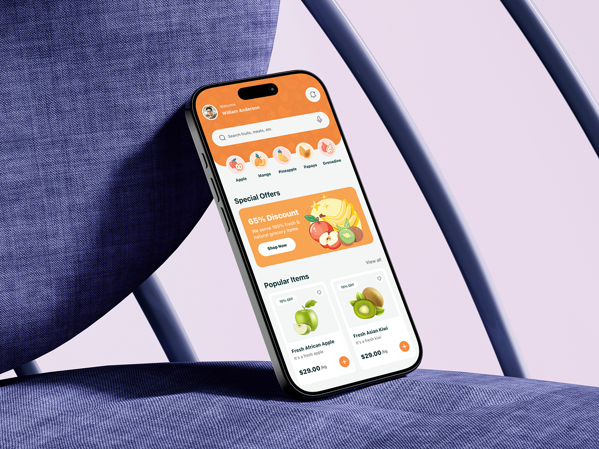
This grocery delivery mobile app home screen was designed by starting with a simple question: how do users decide what to buy in under 10 seconds? The core challenge was cognitive overload. Grocery apps often fail because they throw too many products, banners, and categories at users at once. To solve this, I designed the layout to follow a clear visual hierarchy. The personalized greeting builds trust immediately, while the search bar and category icons reduce decision friction by letting users jump straight to intent-driven actions. Special offers are placed above the fold with bold contrast to capture attention without overwhelming the screen. Product cards focus on scannability first: image, name, price, discount, and a clear add action. No unnecessary details interrupt the buying flow. The spacing, rounded elements, and warm color palette are intentional choices to signal freshness, comfort, and approachability. From a UX perspective, the goal was speed, clarity, and confidence. Every component supports quick recognition, fewer taps, and predictable interactions. This design is less about decoration and more about guiding behavior smoothly from browse to cart. If you were optimizing this experience for repeat weekly shoppers, what would you improve first?
Support this project
Upvote