Grocery Delivery Mobile App - My Cart Screen Design

Project description
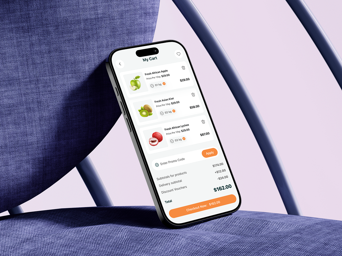
This My Cart screen was designed around a critical moment in grocery shopping: the final decision before checkout. At this stage, users don’t want surprises, friction, or mental math. My first priority was clarity of items. Each product card clearly shows the image, weight, unit price, and subtotal, so users can instantly validate their choices. Quantity controls are placed close to the product to support fast adjustments without breaking flow. Next came cost transparency. Instead of hiding fees, the breakdown clearly separates product subtotal, delivery cost, and discounts. This reduces checkout anxiety and builds trust. The promo code field is visible but not dominant, ensuring it doesn’t distract users who just want to complete their purchase. Finally, the checkout CTA is bold, sticky, and price-reinforced. Showing the final amount inside the button helps users commit with confidence. The challenge was balancing detail with simplicity on a small screen. Hierarchy, spacing, and restraint made the difference. What would you improve on a cart screen to increase checkout confidence?
Support this project
Upvote