Grocery Delivery Mobile App - Product Details Screen

Project description
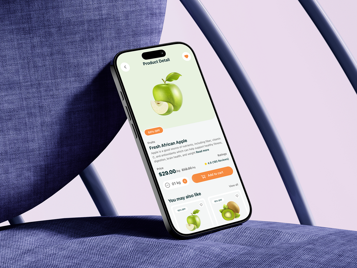
This product details screen for a grocery delivery mobile app was designed around one critical moment: the decision to add an item to the cart. In grocery apps, this screen often becomes a drop-off point due to clutter, uncertainty, or missing trust signals. My goal was to remove hesitation. The large product image establishes visual confidence first, because users buy with their eyes. Clear product naming, category labeling, and discount visibility immediately answer what this is and why it’s worth buying now. Pricing is intentionally transparent, showing both the discounted and original price to reinforce value. Quantity selection is simple and frictionless, avoiding unnecessary steps. Ratings and reviews are placed near the decision zone to support trust without overwhelming the user. The add-to-cart CTA is bold, reachable, and persistent, designed to reduce thumb travel and speed up action. Secondary recommendations appear only after the primary decision area, keeping focus intact. The biggest challenge was balancing information density with clarity on a small screen. The solution was hierarchy, spacing, and progressive disclosure. If you were optimizing this screen for higher conversion, what element would you experiment with first?
Support this project
Upvote