Grocery Shopping Mobile App - Home Screen Design

Project description
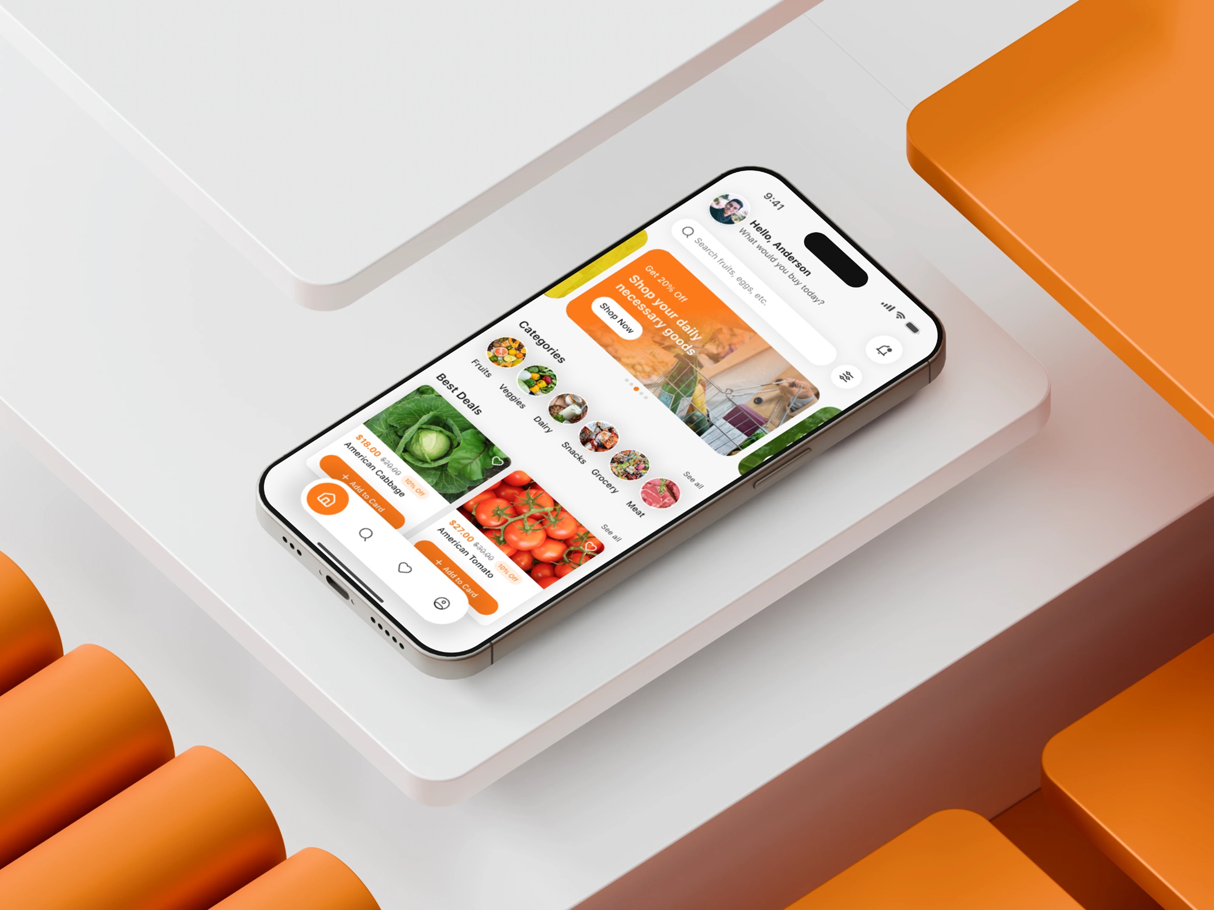
The idea behind this Grocery Shopping Mobile App Home Screen came from one core question: “How can we make the shopping experience feel lighter?” Users often face decision fatigue when browsing groceries, so I mapped every component to reduce friction. The search bar was placed upfront to support high-frequency behavior. Categories were streamlined into simple visual nodes that minimize cognitive steps. Product cards in the “Best Deals” section intentionally use strong imagery and structured spacing to help users recognize items instantly without slowing down. One of the biggest challenges was balancing visual richness with simplicity. Too much imagery leads to noise; too little weakens product appeal. Through iterative testing, I found a middle ground that maintains clarity while keeping the experience vibrant and engaging. In your opinion, what’s the most overlooked UX decision on a mobile home screen?
Support this project
Upvote