Grocery Shopping Mobile App - My Cart Screen Design

Project description
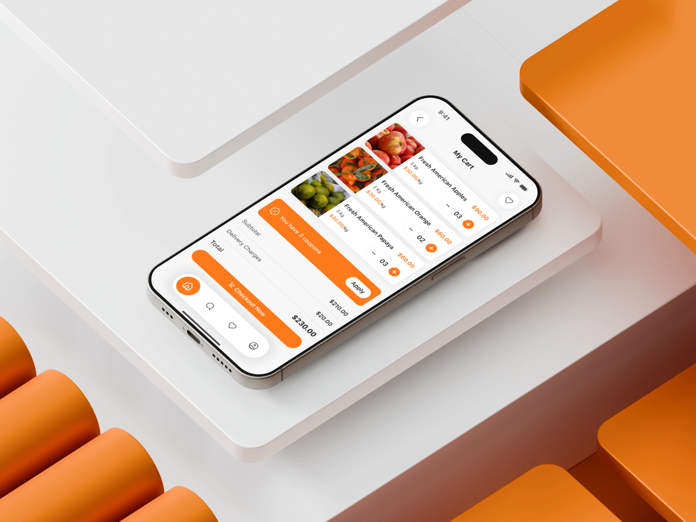
This My Cart screen was designed for a grocery shopping mobile app with a curiosity-driven approach. Instead of asking “What do users tap next?”, I asked “What do they wonder next?” That insight changed the layout. Users wonder about totals, delivery charges, and available coupons—so I surfaced those first, not last. I reduced mental load by grouping related information: items and quantities together, cost details in a single block, and the CTA anchored at the bottom for predictable reach. Spacing plays a quiet but powerful role here—every gap helps reset the user’s focus without overwhelming them. The coupon row acts as a trust-building moment, showing that the app respects the user’s desire to save before paying. The calm palette keeps the emotional tone steady while the orange accent gently nudges motion toward checkout. Instead of designing for beauty first, I optimized for psychological flow—helping users feel in control of their decisions. Which moment in a checkout process do you think most influences completion rates?
Support this project
Upvote