Grocery Shopping Mobile App - Product Details Screen Design

Project description
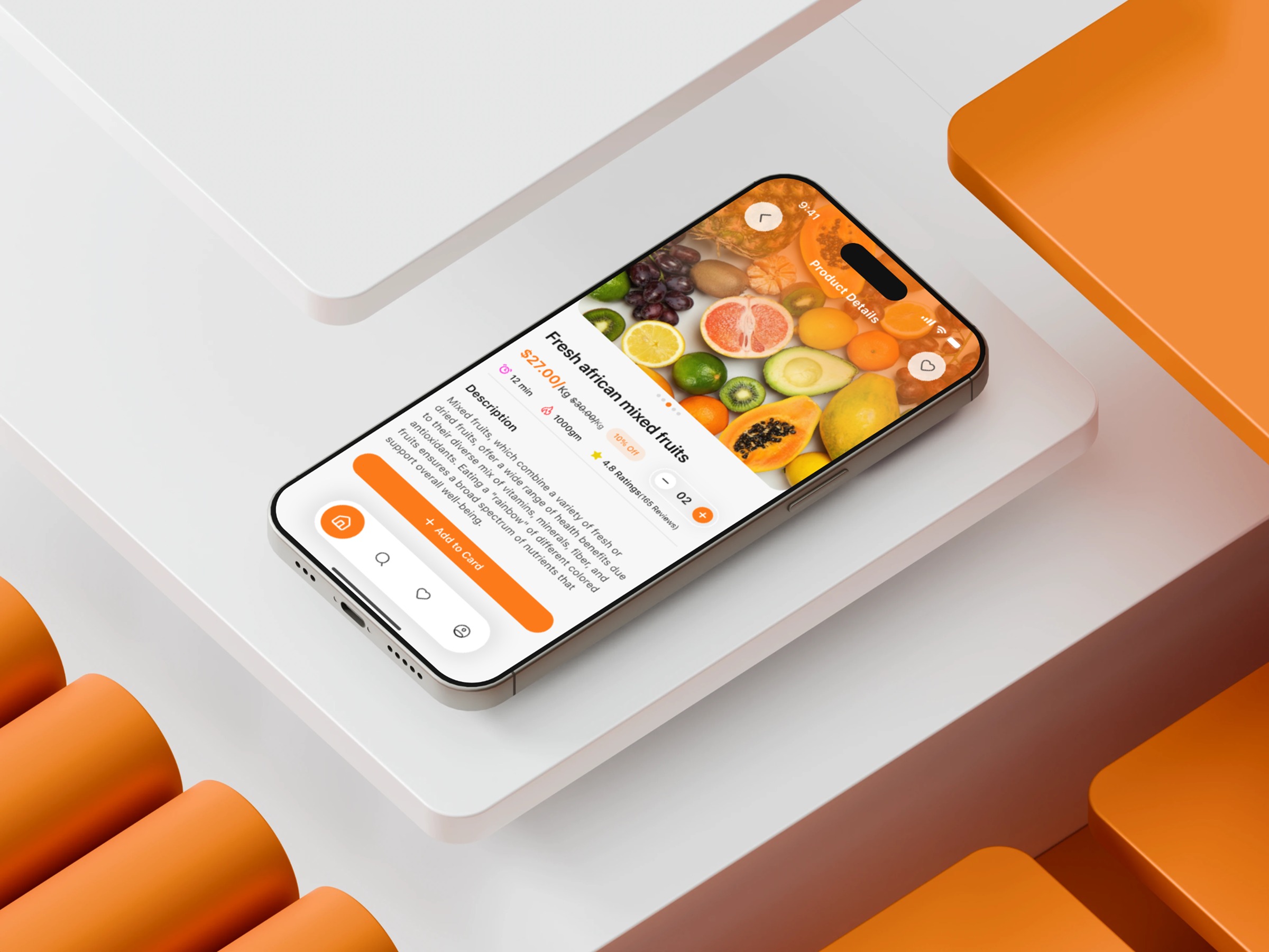
This Grocery Shopping Mobile App Product Details Screen was designed around one idea: help users decide without slowing down. In fast-moving grocery apps, hesitation kills conversions. So I structured the experience around minimal friction and maximum clarity. The hero image sets the emotional tone — large, fresh, and instantly recognizable. Beneath it, decision-critical data is organized in a tight visual flow: price, rating, nutritional cues, and delivery timing. Each element is intentionally positioned to reduce eye movement and increase comprehension speed. The description section uses loose spacing and simple formatting to keep reading effort low. Meanwhile, the Add to Cart button grabs attention through contrast and placement, designed specifically for the thumb zone. The quantity selector complements it by offering direct, distraction-free adjustments. The final result is a product page that feels quick, intuitive, and trustworthy — built for users who want speed without sacrificing clarity. Which part of this design would you optimize even further?
Support this project
Upvote