Healthtech Telemedicine Mobile App - Doctor's Detail Screen

Project description
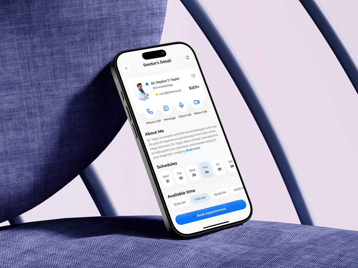
This Doctor’s Detail screen was designed to solve one critical UX problem: turning hesitation into confident action. In telemedicine, users don’t just choose a doctor—they choose trust. That insight shaped the entire layout. The top section immediately establishes credibility with name, specialty, ratings, reviews, and pricing—all visible without scrolling. This reduces uncertainty and decision friction. The multi-contact action row (call, message, voice, video) supports different comfort levels and urgency states, letting users choose how they want to connect rather than forcing a single path. The “About Me” section balances depth with scannability. Long bios can overwhelm users, so content is structured for quick validation first, deeper reading second. Scheduling is placed below to maintain a logical decision flow: trust → availability → action. The fixed primary CTA ensures the next step is always clear, especially on long screens. This screen isn’t about aesthetics—it’s about reducing cognitive load while increasing confidence, which is essential in healthcare UX. What trust signals do you think matter most when users choose a doctor online?
Support this project
Upvote