Healthtech Telemedicine Mobile App - Home Screen Design

Project description
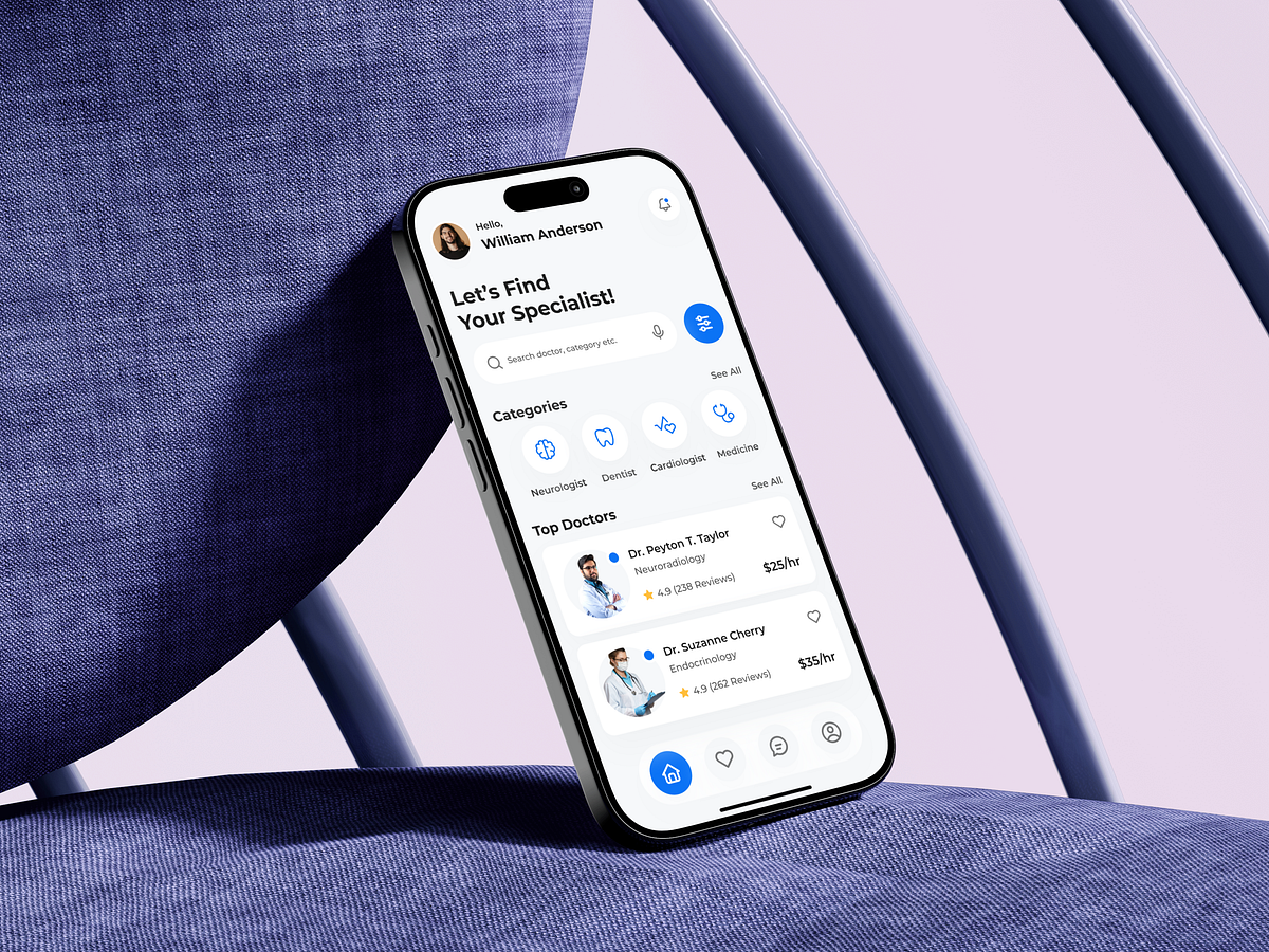
This Healthtech Telemedicine Mobile App home screen was designed with one core UX goal in mind: reduce cognitive load at the exact moment users are seeking medical help. The thought process started with urgency. Users don’t open a telemedicine app to explore; they open it to find the right specialist fast. That’s why the primary headline immediately sets intent, followed by a dominant search field designed for thumb reach and quick scanning. Specialist categories are presented as icon-first chips to support recognition over recall, minimizing decision fatigue. Instead of overwhelming users with filters upfront, the design gradually introduces complexity only when needed. The Top Doctors section solves a trust problem. Ratings, reviews, specialty, and pricing are surfaced at a glance to reduce hesitation and shorten decision time. Every card is structured to answer the silent user questions: Who is this? Are they credible? Can I afford them? Navigation stays intentionally minimal. A clear bottom bar ensures predictability, while spacing and typography prioritize calmness—critical in healthcare contexts. This screen isn’t about aesthetics alone; it’s about designing confidence into every interaction.
Support this project
Upvote