Healthtech Telemedicine Mobile App - Live Video Calling Screen Design

Project description
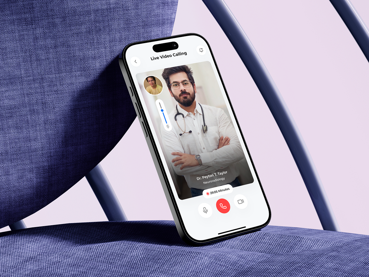
Designing this Live Video Calling screen wasn’t about video—it was about presence, trust, and calm. In telemedicine, this is the moment where the product must disappear and the human connection must take over. My UX process started with one key question: How do we make a patient feel safe and heard on a small screen? The doctor’s video is intentionally dominant, centered, and uninterrupted, reinforcing attention and credibility. UI controls are minimized, clearly labeled, and placed within easy thumb reach to reduce anxiety during live interaction. Muted colors and generous spacing were chosen to avoid visual noise, especially during emotionally sensitive consultations. The timer and call status provide reassurance without distraction, while secondary actions stay accessible but unobtrusive. The challenge was balancing control vs. simplicity—users need confidence that help is available, without being overwhelmed by options. Every decision here supports focus, emotional comfort, and continuity of care. Good healthtech UX doesn’t impress users—it reassures them. What makes a live medical video call feel trustworthy to you?
Support this project
Upvote