OTT Streaming Mobile App - Home Screen (Light Mode) Design

Project description
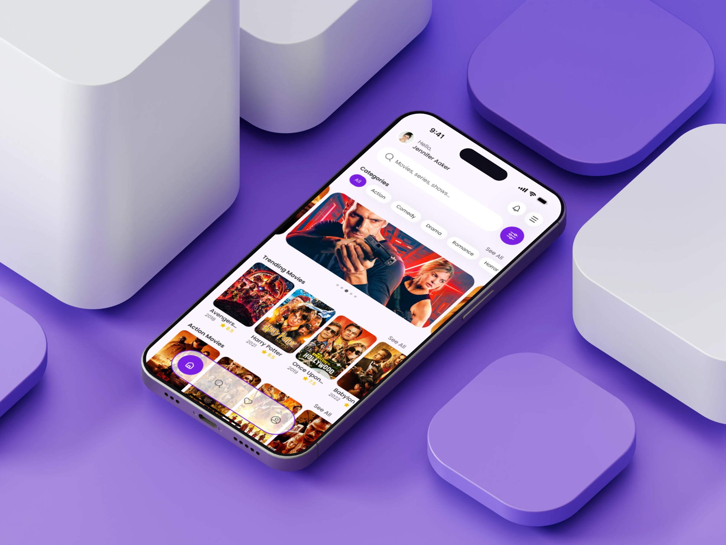
Here’s my latest UI exploration: the Home Screen of an OTT Streaming Mobile App in Light Mode. This design experiment explores how minimal surfaces, soft tones, and high-impact visuals can coexist without overwhelming the user. The layout uses clear hierarchy — a strong hero banner for trending content, genre chips for quick contextual filtering, and visually rich poster cards arranged in clean rows. The challenge was balancing cognitive simplicity with visual depth, ensuring the interface feels lightweight even when packed with content. Minimal bottom navigation helps maintain flow, keeping interactions predictable and smooth. Every choice, from spacing to color, was guided by the question: “How can we reduce browsing fatigue and increase delight?” What’s the most underrated detail in streaming app UI design, in your opinion? #StreamingApp
Support this project
Upvote