Career Coaching Website Design Concept

Project description
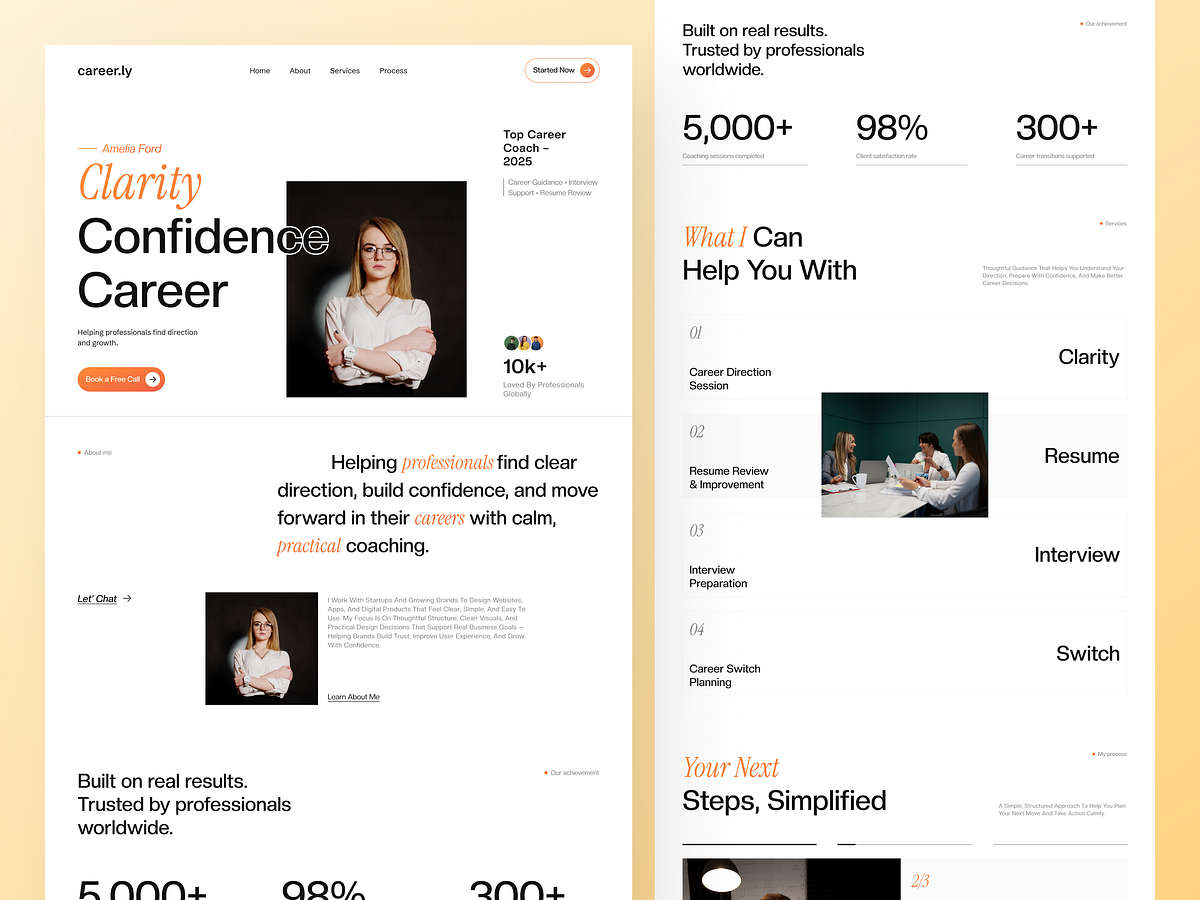
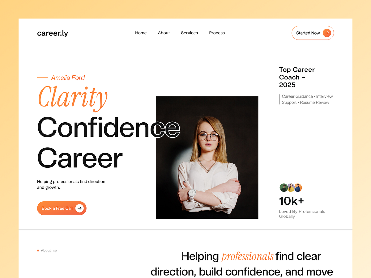
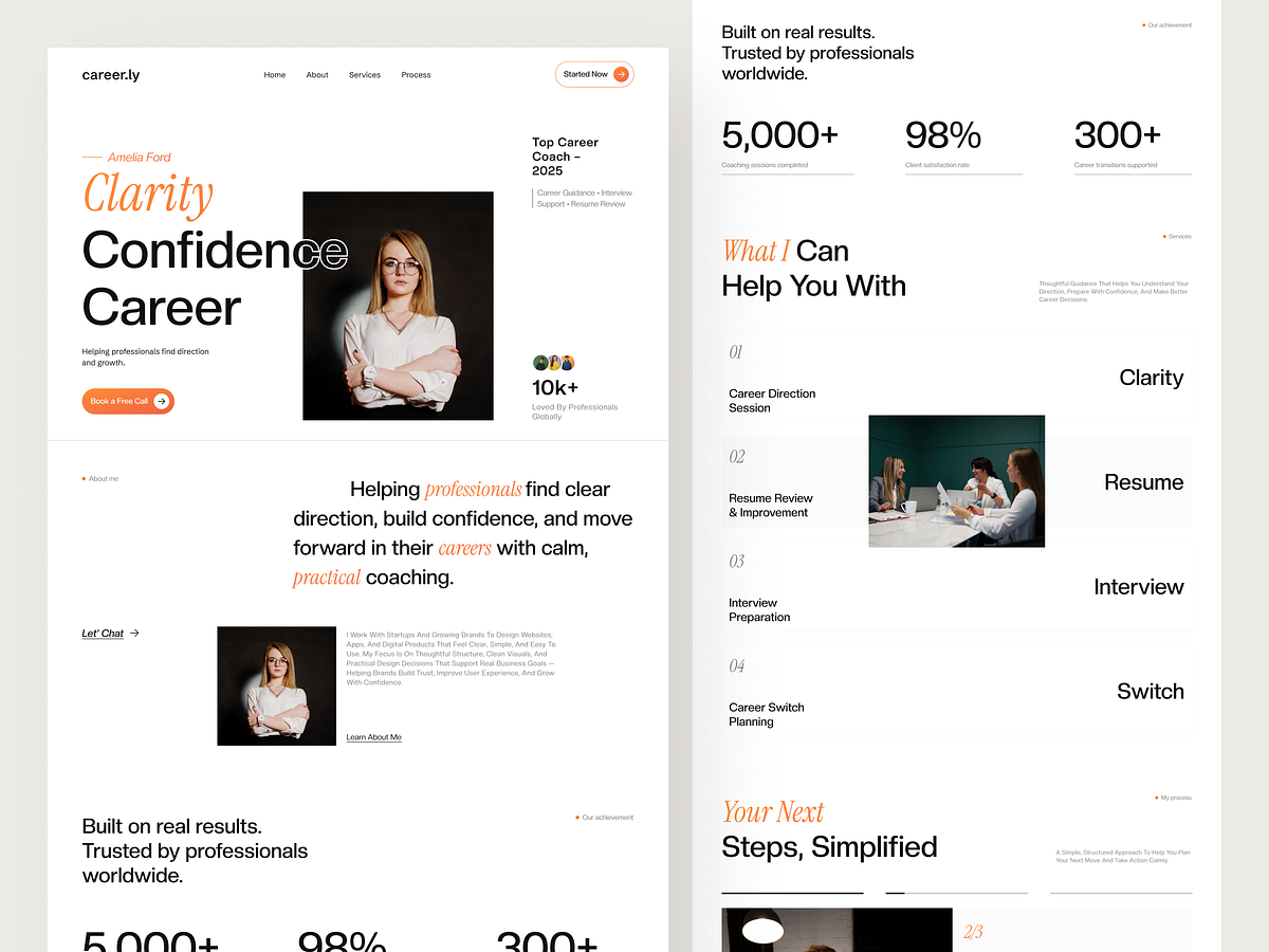
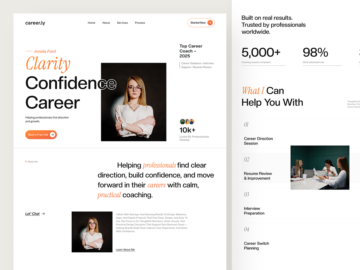
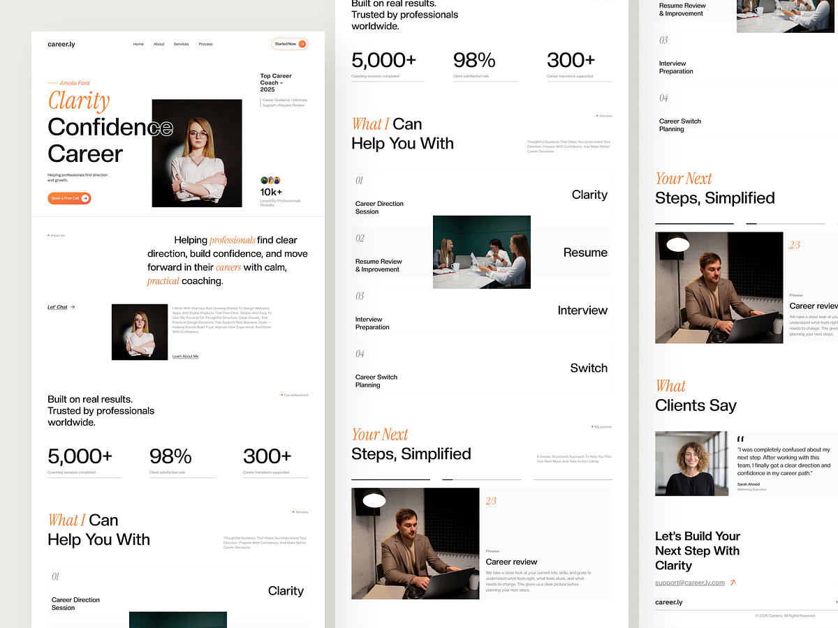
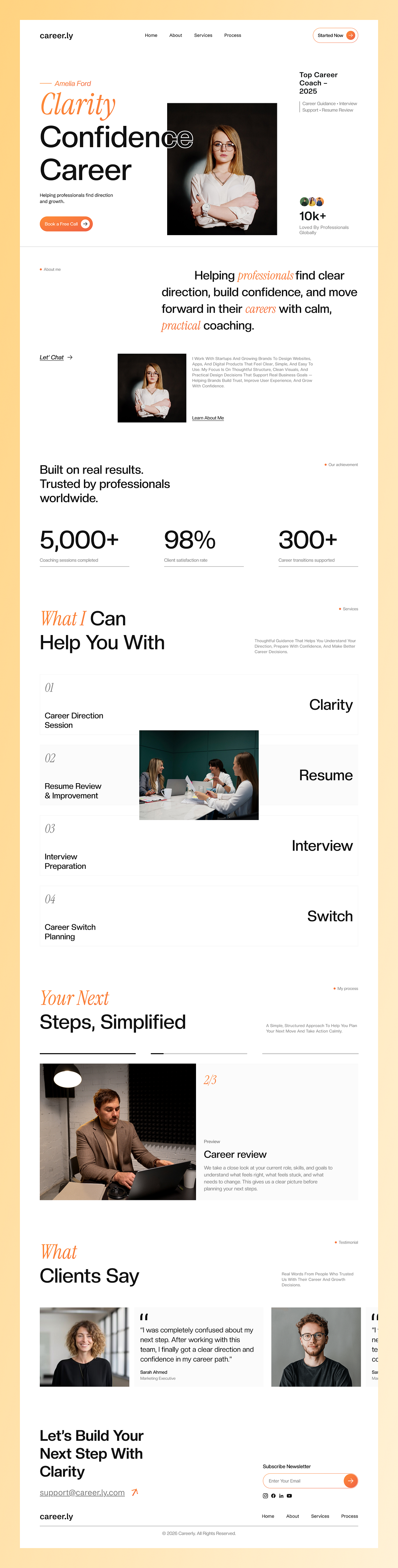
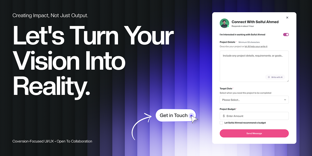
I've worked with career coaches who had beautiful websites that got zero inquiries.I've also worked with coaches who had simple sites that booked out in weeks.The difference?One tried to impress. The other tried to calm.Because here's what most designers miss:Your clients aren't lazy. They're not confused.They're overwhelmed.Too many options. Too many opinions. Too much noise.So I design career coaching sites like quiet conversations.The first screen doesn't push.It reassures.You're in the right place. You don't have to rush. We'll figure this out together.Clear hierarchy. Soft pacing. Nothing fighting for attention.As visitors scroll, each section answers one question they're already asking:Can you help me get unstuck? Do you understand what I'm dealing with? Can I trust you with something this personal?The copy stays human. The photos feel real. The structure guides without pressure.That's how I approach UI and UX in Figma, WordPress, and Framer.I don't design pages to impress other designers.I design clarity.The kind that makes someone sit back and think:"Okay. I can breathe. I can take the next step."If you're a career coach or service-based founder who wants your site to feel supportive the moment it loads, message me.

Support this project
Upvote