MoveIn 24 Branding Project

by Sanjin Halilovic · Nov 2025
shot
Project description
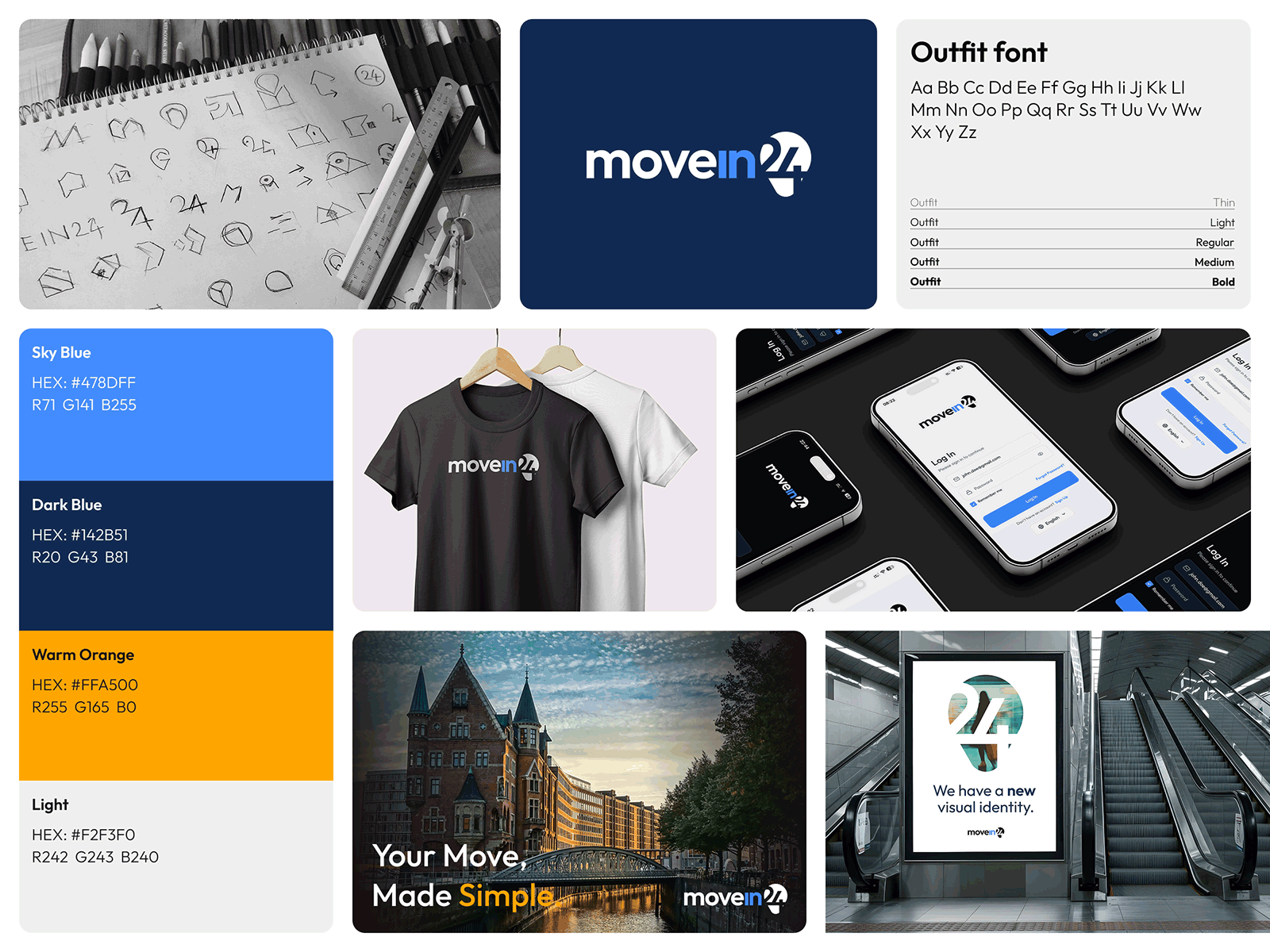
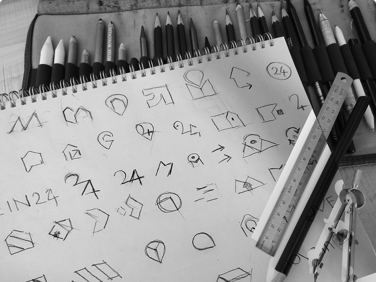
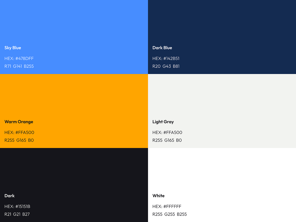
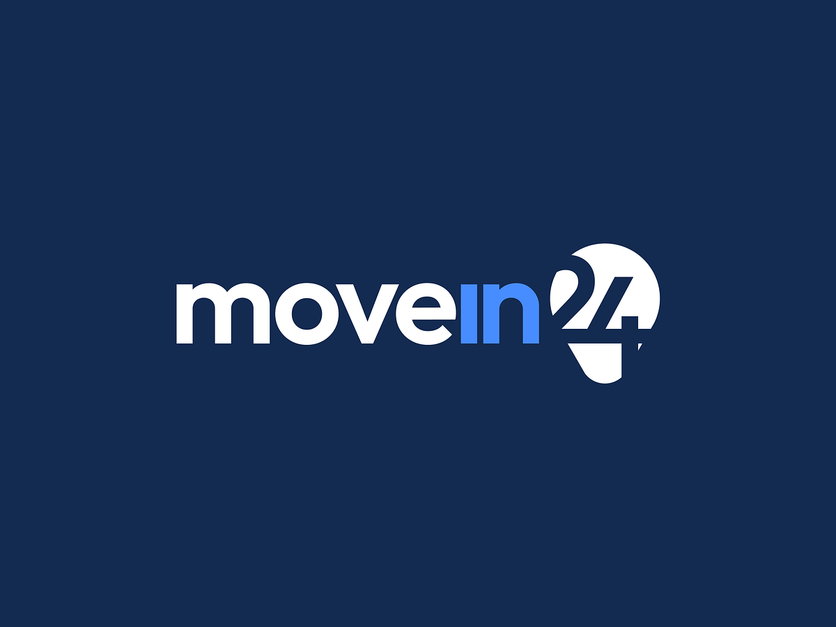
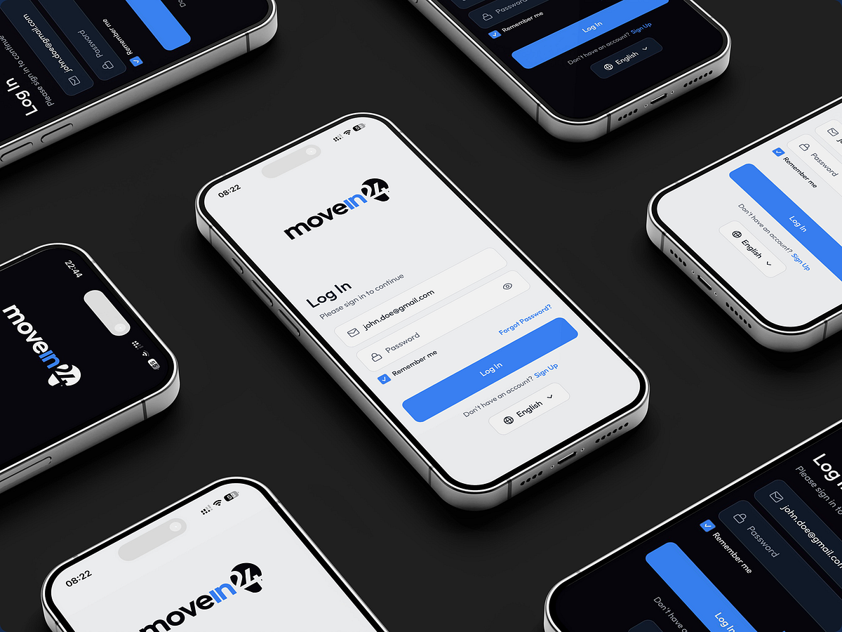
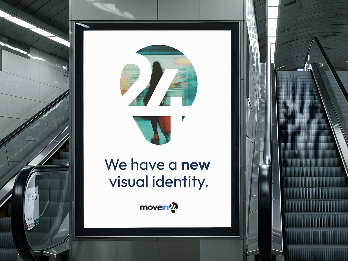
Client: MoveIn24Services: Visual Identity, Brand SupportYear: 2025MoveIn24 helps people relocate abroad with ease — simplifying everything from job search to housing and paperwork. The new identity was built around clarity, trust, and direction — key values for anyone starting a new chapter in a new country. The logo combines a location pin with the number 24, symbolizing constant support and guidance. The highlighted “in” represents moving in — to a new home, a new place, a new life. The color palette balances warm orange for optimism with deep blue for reliability, while the clean Outfit typeface ensures a modern and approachable look across digital and physical touchpoints.
Support this project
Upvote