Nucleus Nordic Brand Identity


Project description
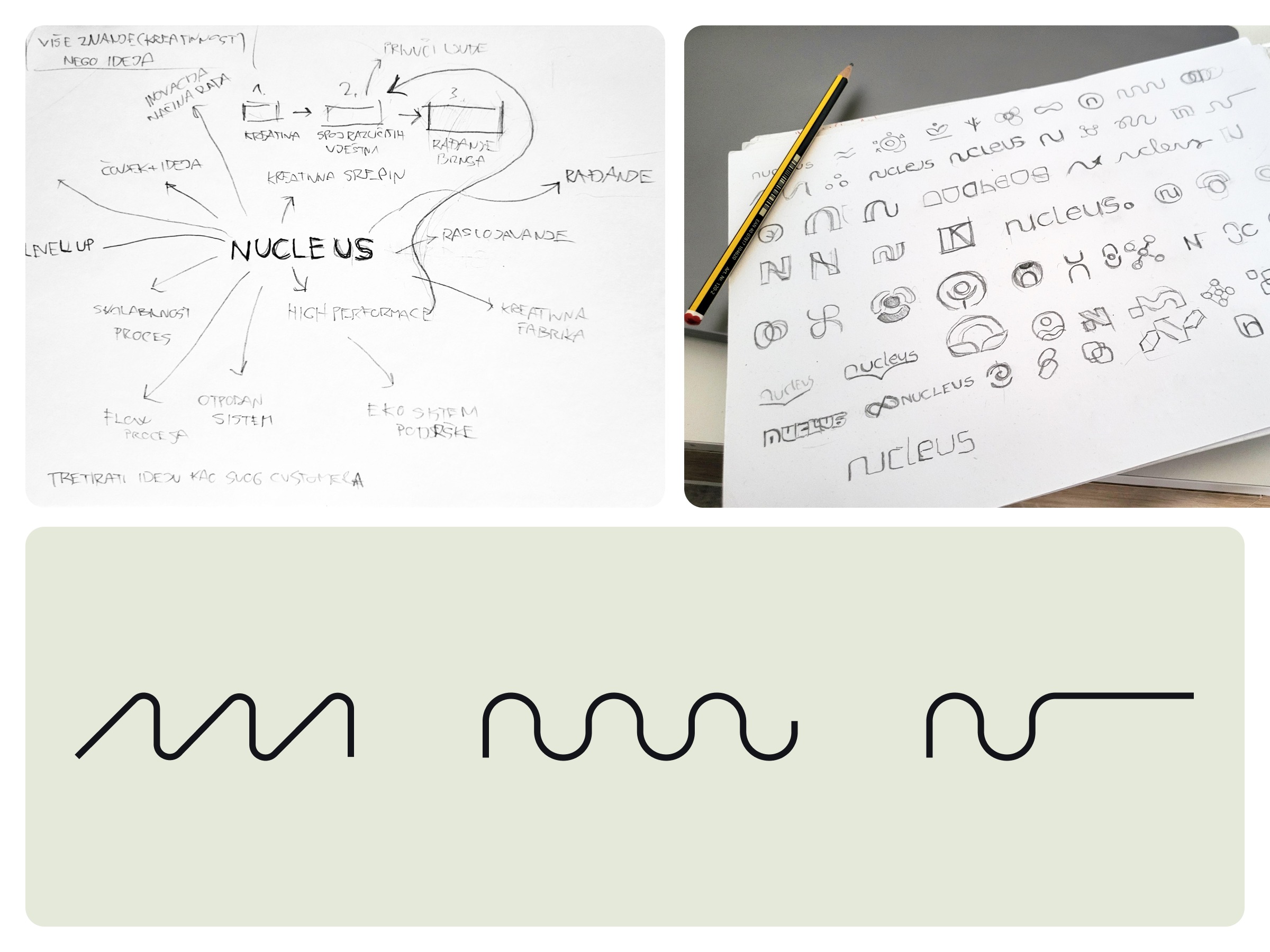
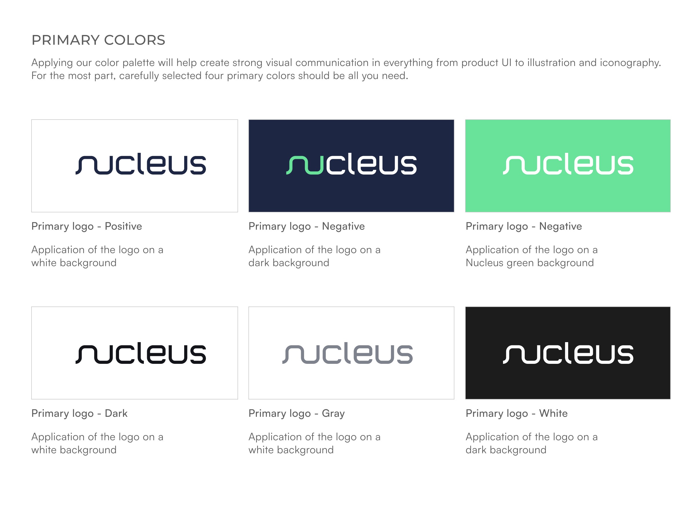
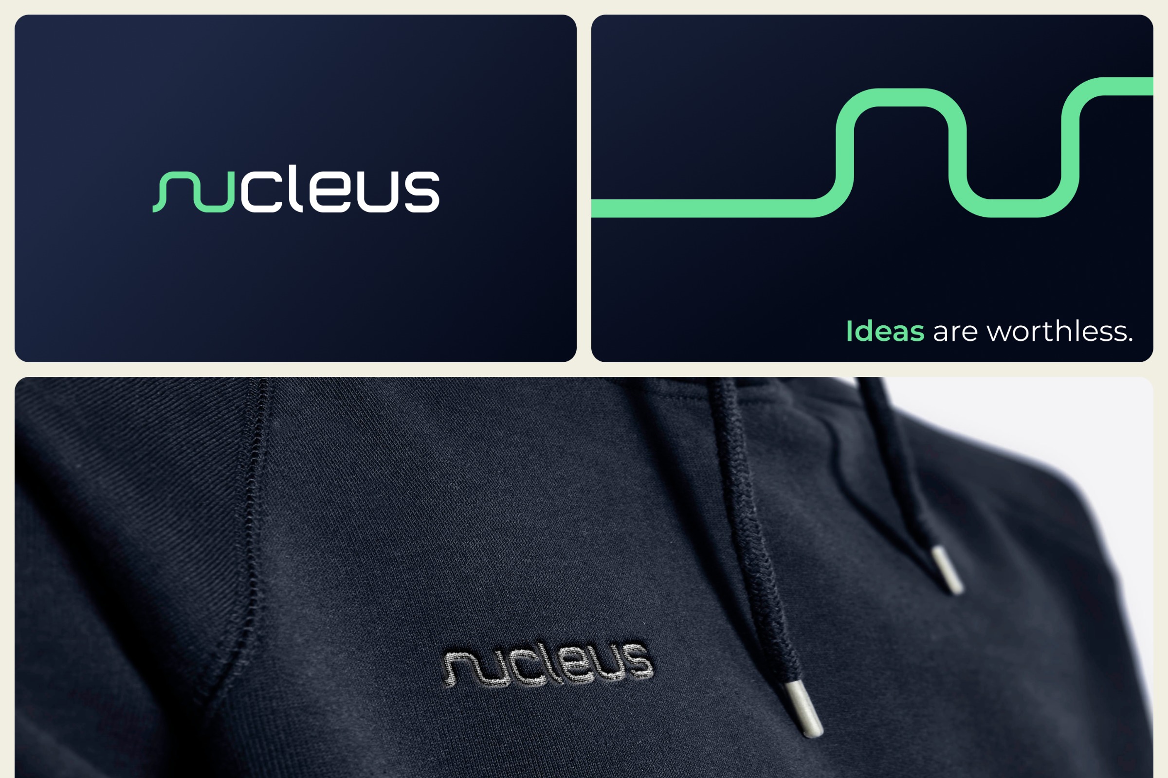
When creating the identity for Nucleus, one of the key concepts was the word FLOW. The goal of Nucleus is to bring together creative people with diverse skills, where each individual contributes to the birth of new business ideas. For this reason, an intervention was made in the typography, where each letter was carefully designed, with N and U connected, forming an integral part of the brand that can be used in patterns and other graphic elements. The Nucleus Nordic visual identity uses two key colors: dark blue and light green, which together create a strong yet balanced palette. The dark blue color dominates the design, symbolizing professionalism, trust, and stability. This color reflects the seriousness and credibility of the brand, which is essential for communicating with a target audience that seeks reliable and expert partners. The light green, on the other hand, introduces an element of freshness, innovation, and sustainability, aligning with the brand’s mission to be a leader in an industry.
Support this project
Upvote