Prevent Rebranding

by Sanjin Halilovic · Jul 2025
shot
Project description
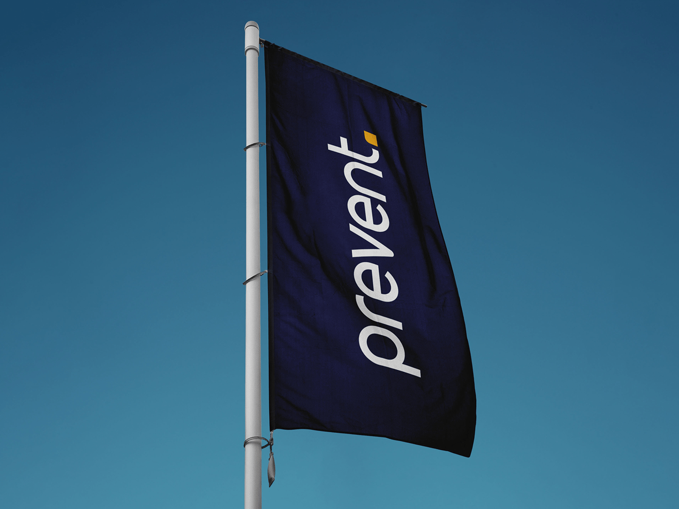
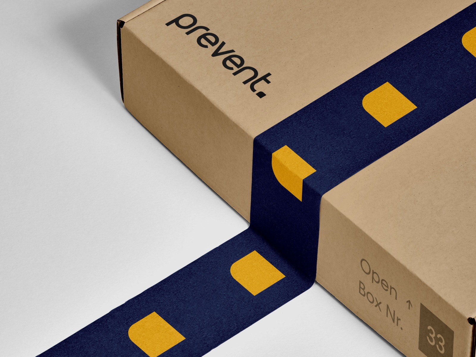
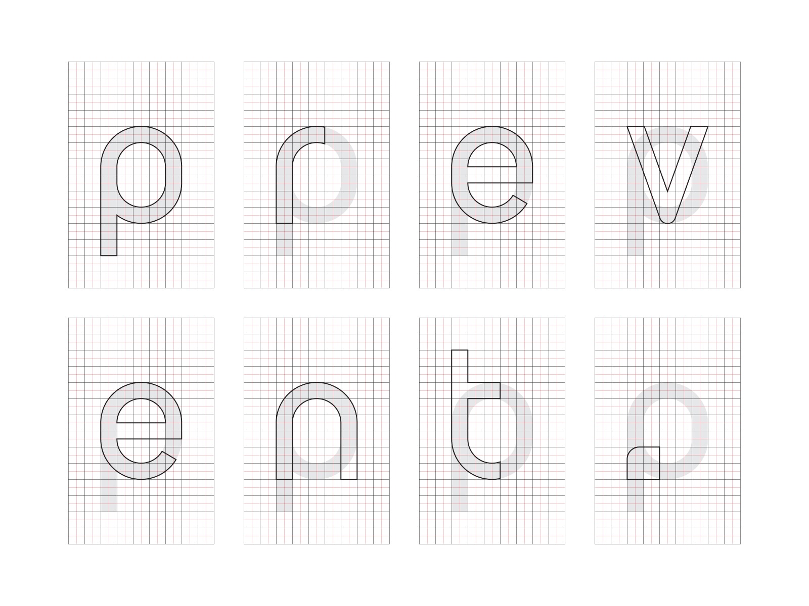
I'm very honored to have been given the opportunity to work on the rebranding project for this company. The dot, which was already part of the old logotype, has been used as one of the core motifs that will be applied throughout various elements of visual communication, ranging from patterns to the shapes of business cards, web elements, social networks, and more. The dot symbolizes the strength and potential that Prevent can bring forth across several industries, including leather, wood, and metal. For this occasion, a new typeface was designed, where the letters were modified in such a way that each one was created within a grid to ensure the most ideal proportions.


Support this project
Upvote