UI/UX Case Study: Redefining the Modern Bike Shop

Project description
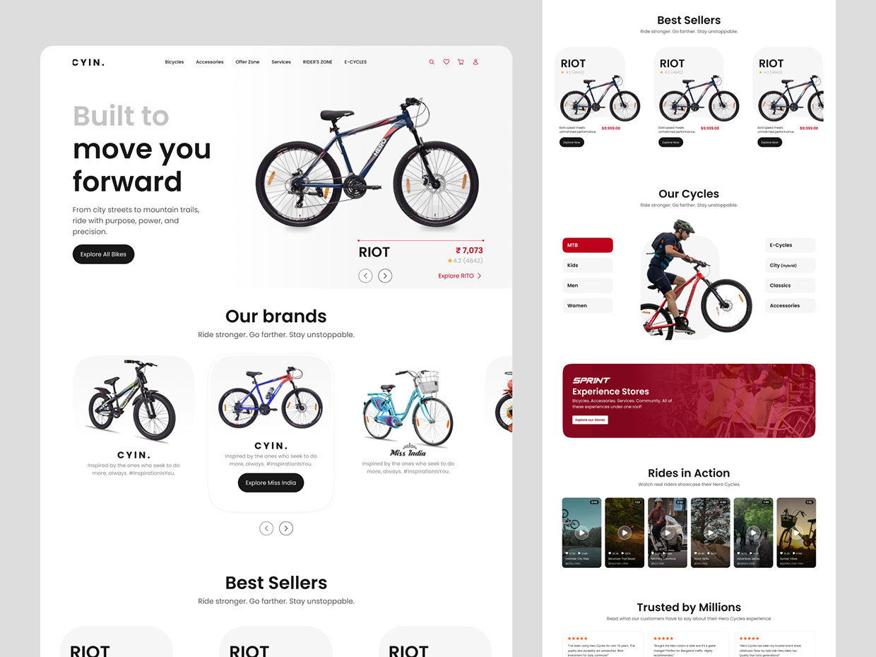
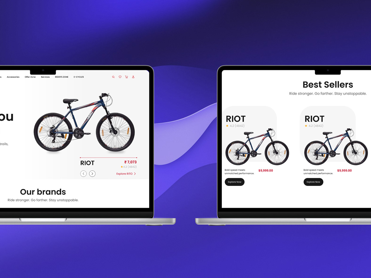
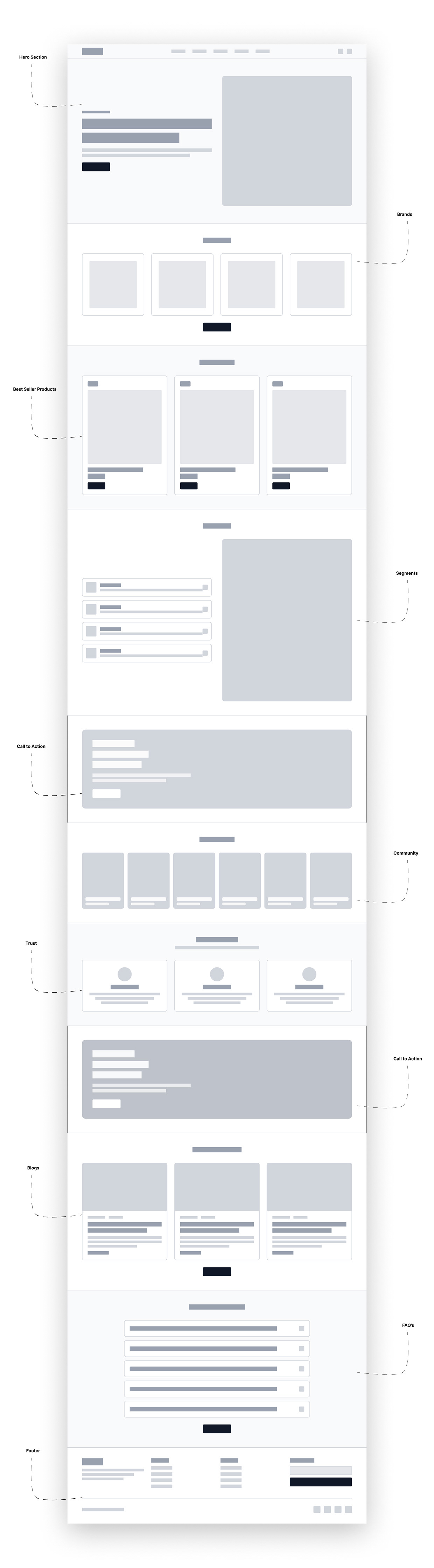
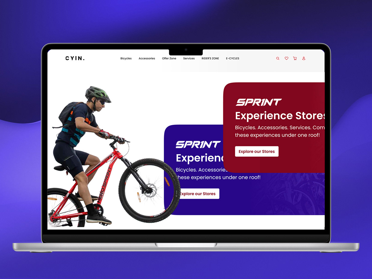
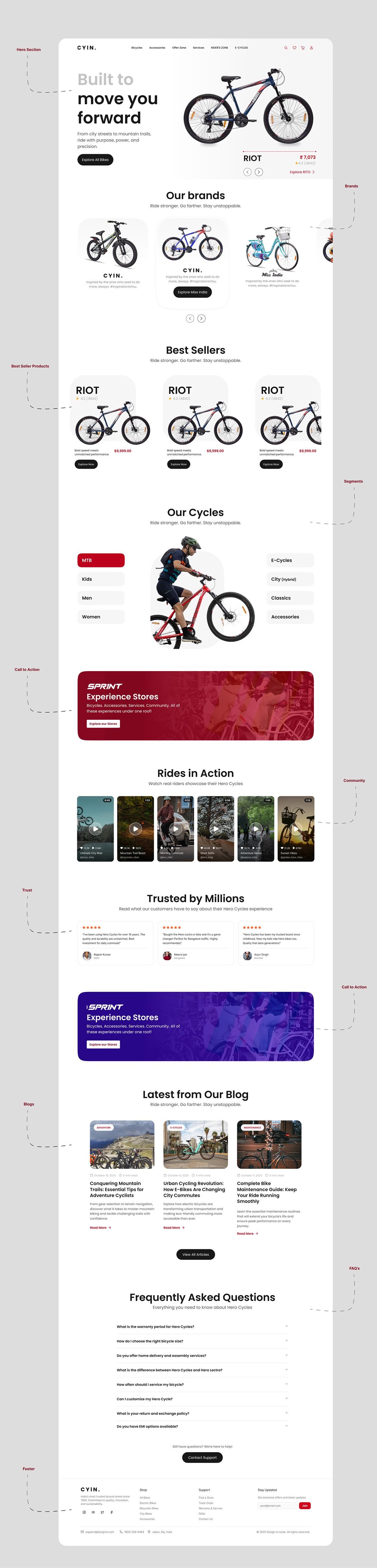
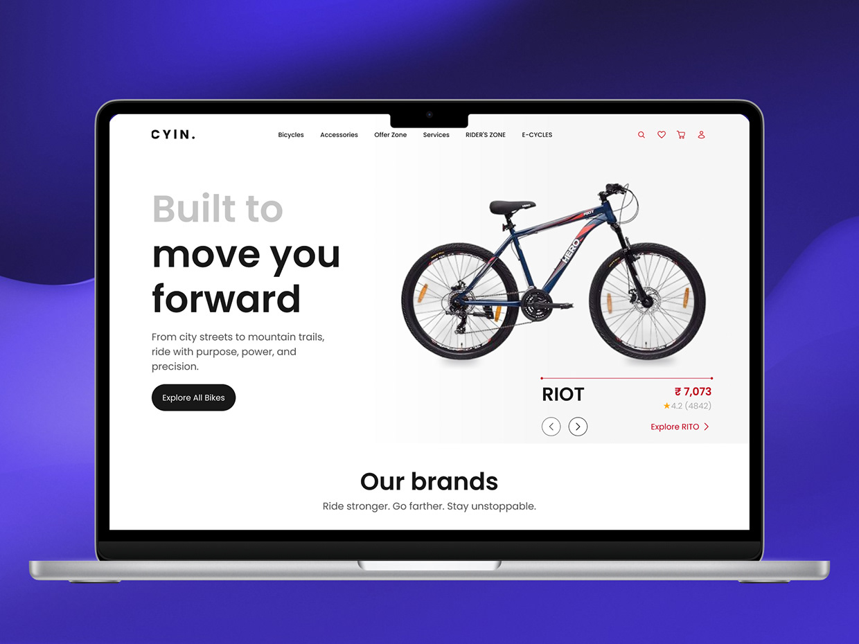
Overview The cycling industry is shifting gears toward a digital-first experience. This case study explores the design of a premium cycling platform that combines minimalist aesthetics with high-utility features. The goal was to create a digital storefront that feels as fast and reliable as the bikes themselves. The Challenge Bike buyers often struggle with technical jargon. The challenge was to present complex specifications (frame geometry, gear ratios, motor power) in a way that is digestible for beginners while remaining detailed enough for pros. The Solution Visual Hierarchy: Large, high-definition hero sections to create an emotional connection with the "ride." Feature Cards: Clean, icon-based technical specs for quick comparison. Lifestyle Integration: Using high-action imagery to bridge the gap between the product and the experience. Responsive Flow: A mobile-first approach ensuring the browsing experience is seamless on the go. Tools Used Figma (UI/UX Design & Prototyping)
Support this project
Upvote