Finora | Brand Identity & Strategy | Sleeko

Project description
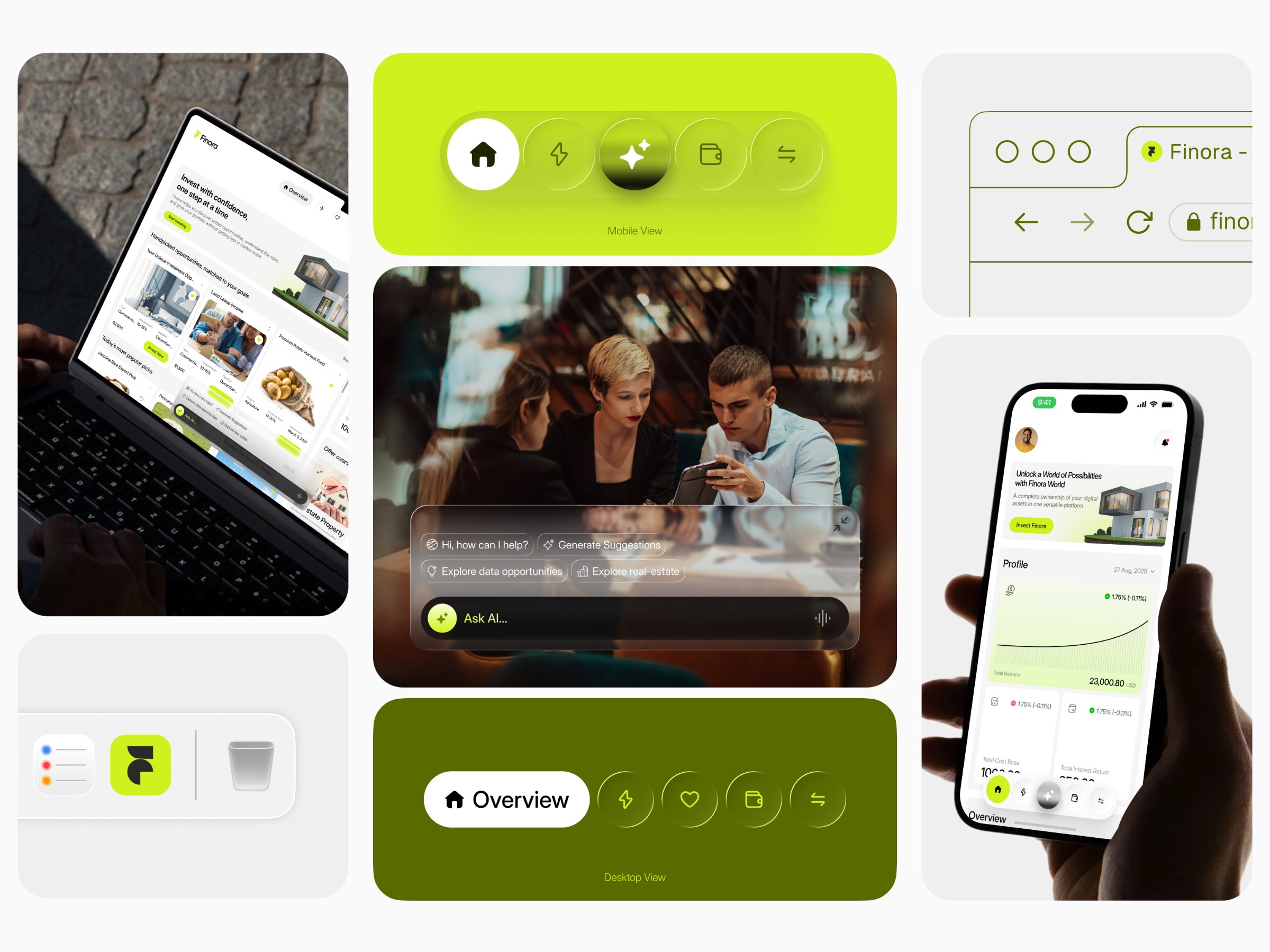
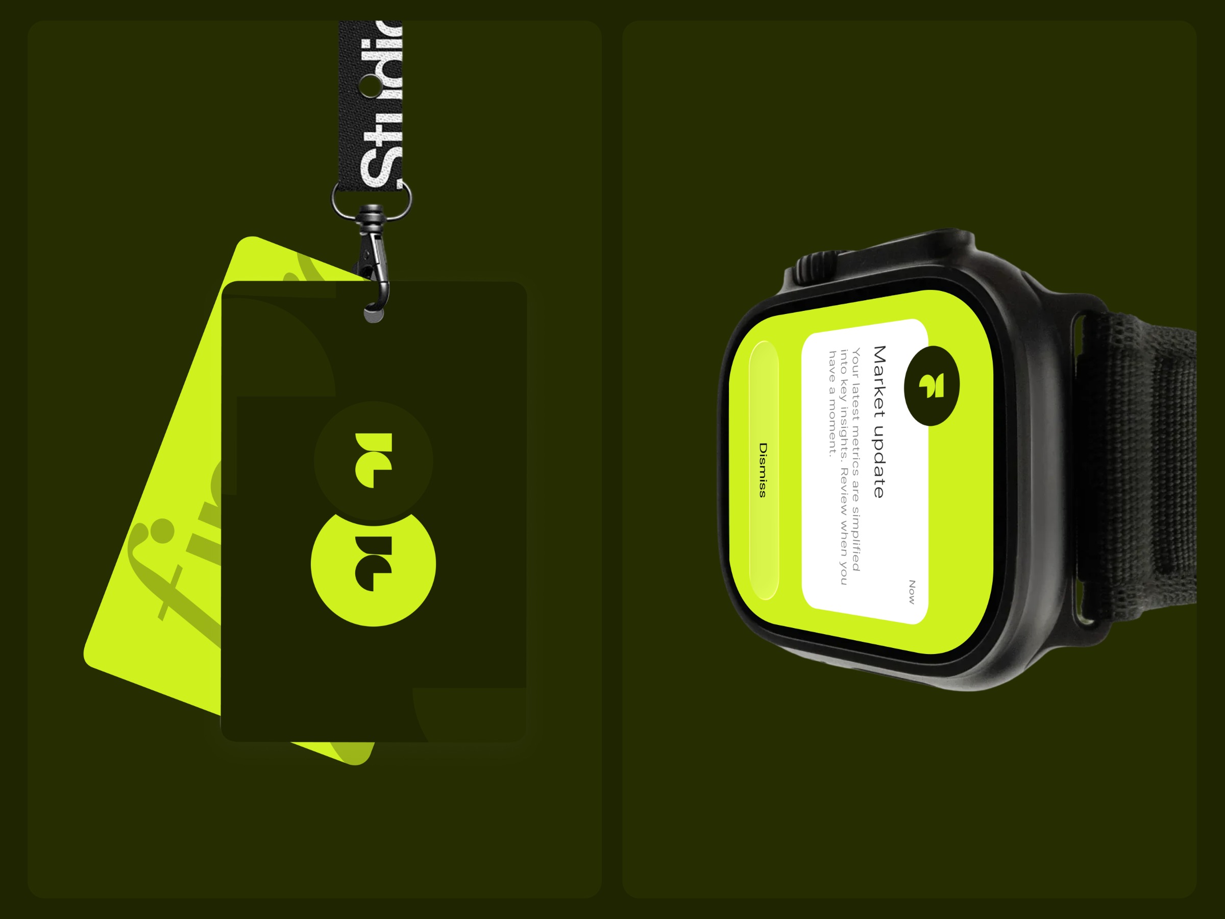
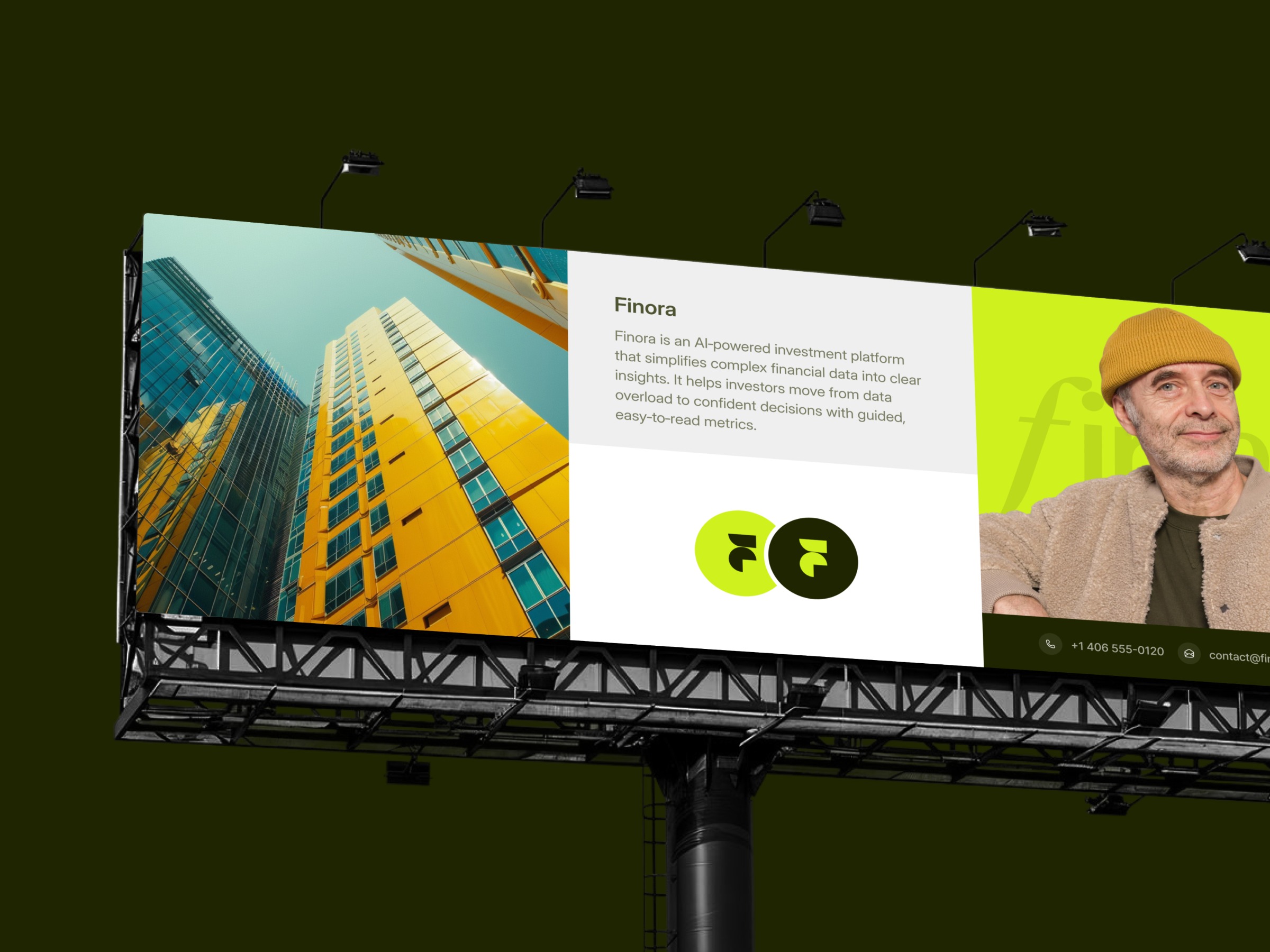
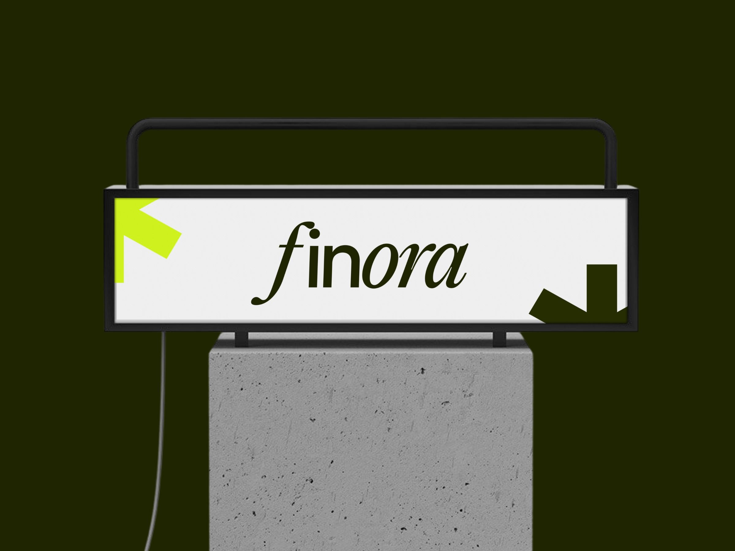
Finora isn’t just designed to function well; it’s built to be instantly recognizable and easy to trust. In a space where financial products often feel complex or overwhelming, the brand takes a different approach: clarity over noise, simplicity over decoration. The logo is intentionally minimal, built with clean geometry and balanced spacing to ensure it scales effortlessly across platforms, from dashboards to mobile screens to marketing touchpoint. Every detail is controlled, so recognition doesn’t depend on context. The visual system follows the same principle: restrained color palette strong contrast for readability consistent spacing and typography Nothing competes for attention. Everything supports understanding. This creates a brand that users can recognize in seconds and remember over time, which is critical in fintech, where trust is everything. At Sleeko, we design focused, conversion-ready SaaS products—from single dashboards to full product ecosystems. If you need a strong product concept, a dashboard redesign, or a launch-ready UI system, let’s talk. Let’s collaborate.
Support this project
Upvote