Pimp Brand Identity Design

Project description
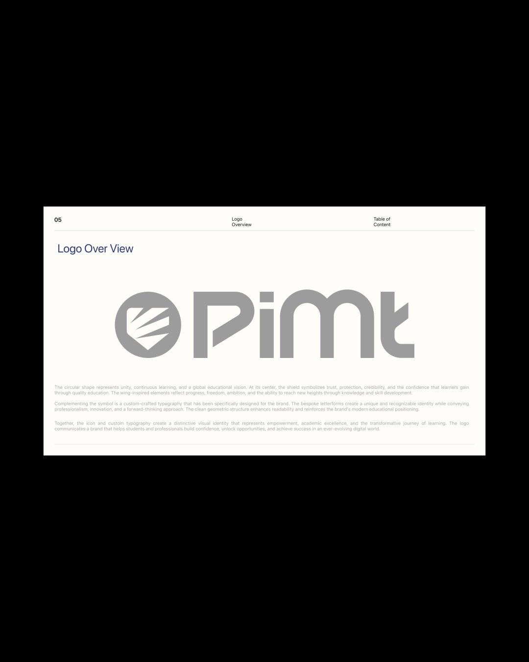
Principle Institution – Rebranding Case Study When we started working on the rebranding for Principle Institution, our first step was understanding what wasn't working in the existing identity. The previous logo already used a shield, which was relevant to an educational institution. However, it looked very generic and lacked a unique identity. The typography was also difficult to read, reducing the overall impact and professionalism of the brand. Instead of completely changing the concept, we chose to preserve the shield because it already represented trust and credibility. We then refined it by introducing a circular form and wing-inspired elements to give the identity more meaning and a modern appearance. The circular shape represents unity, continuous learning, and a global vision for education. The shield at the center stands for trust, protection, credibility, and the confidence students gain through quality education. The wing-inspired elements symbolize growth, ambition, fr


Support this project
Upvote