União Zoófila Rebrand Identity
Project description
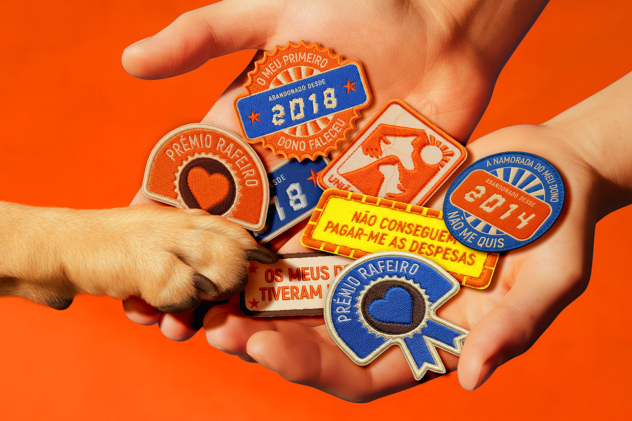
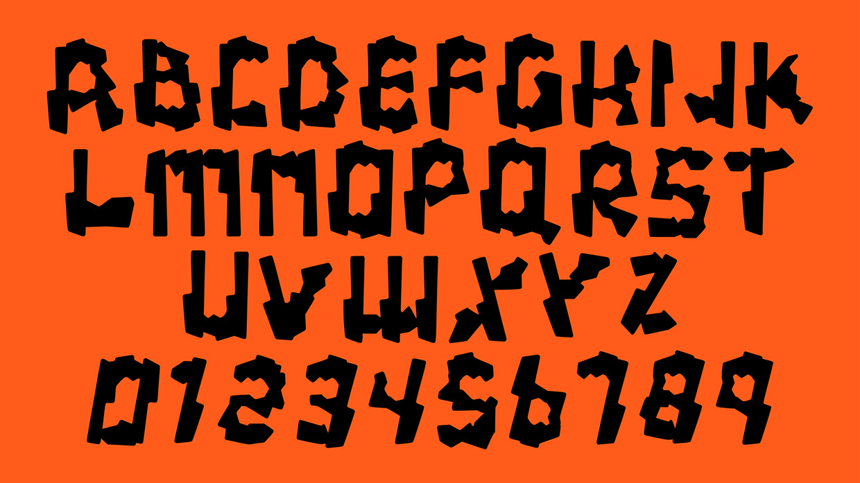
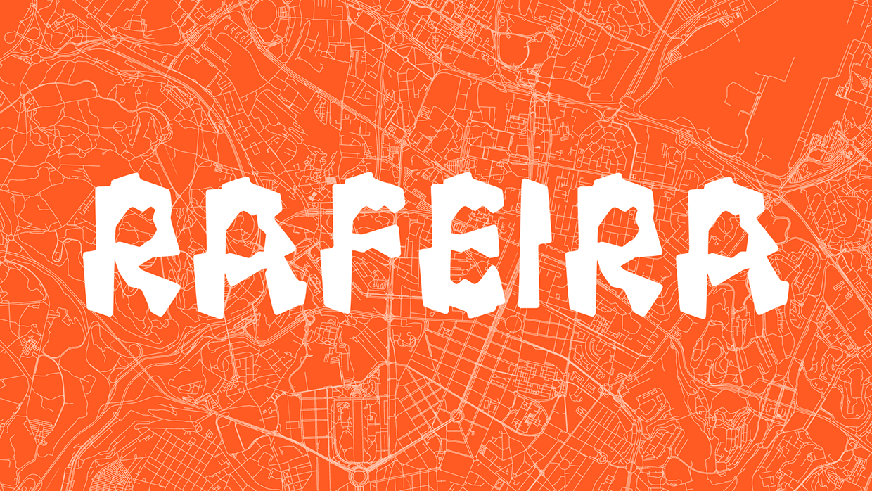
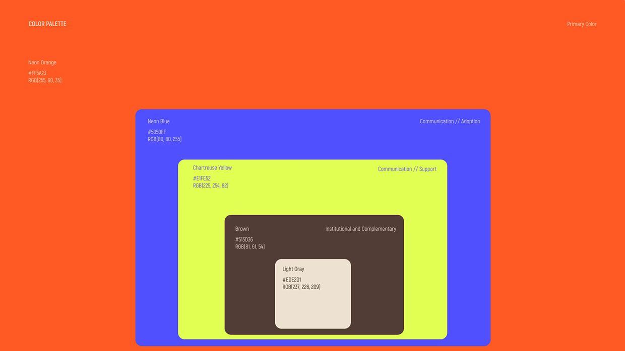
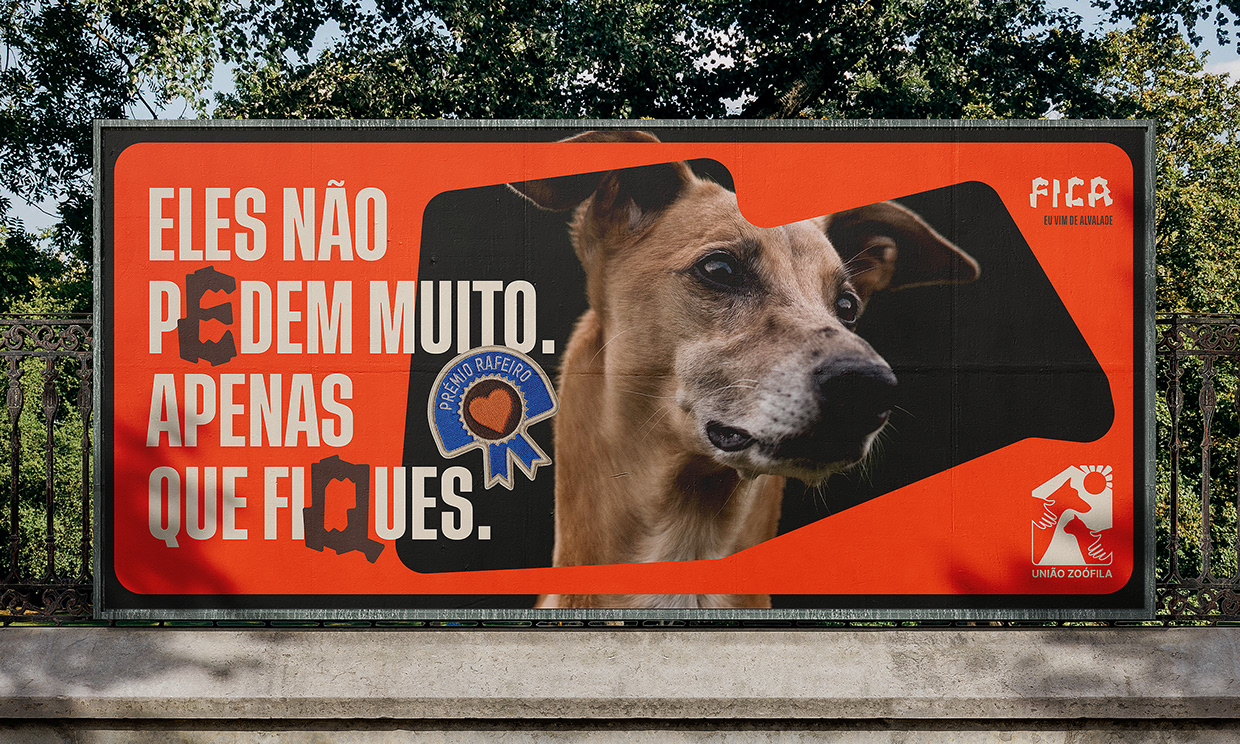
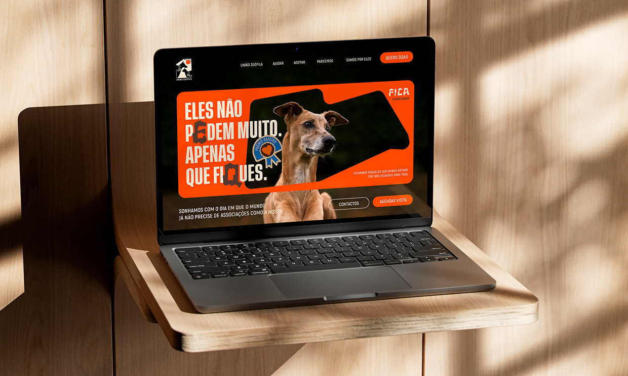
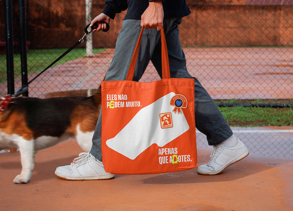
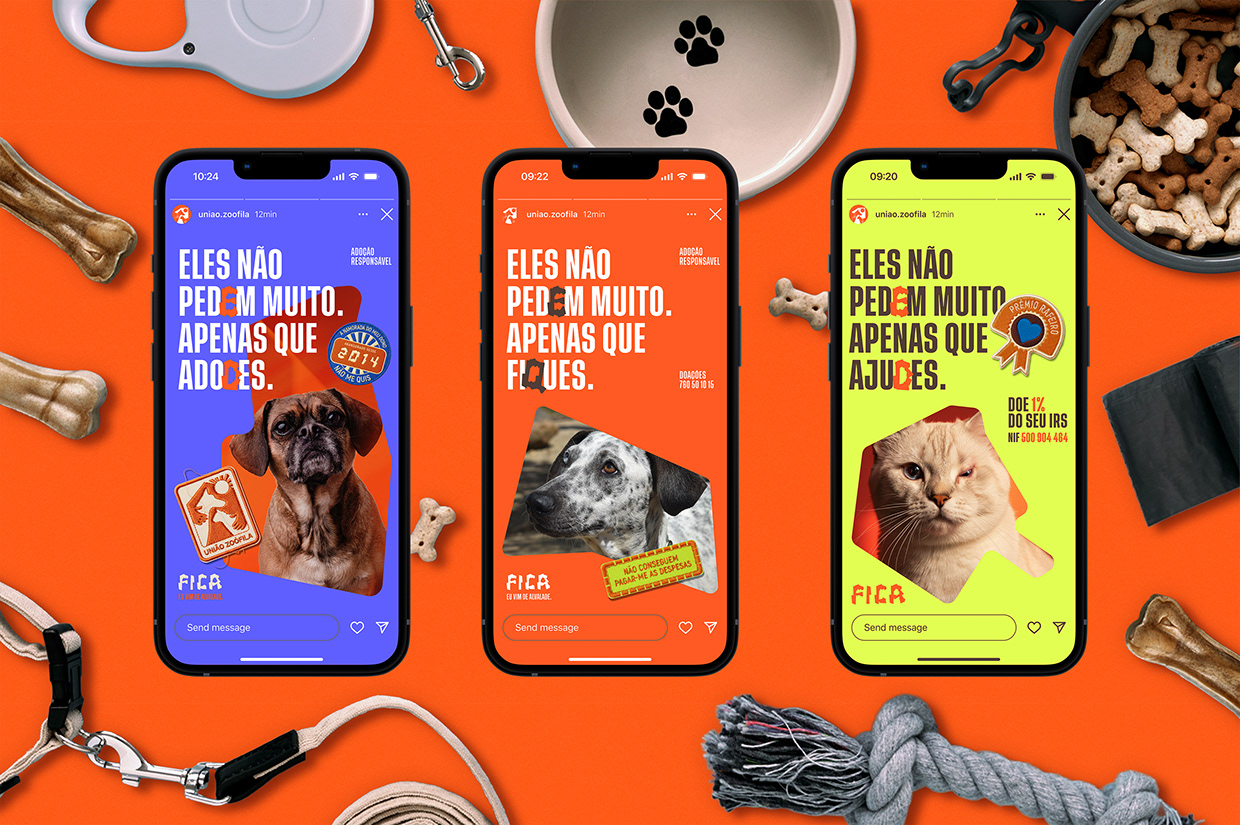
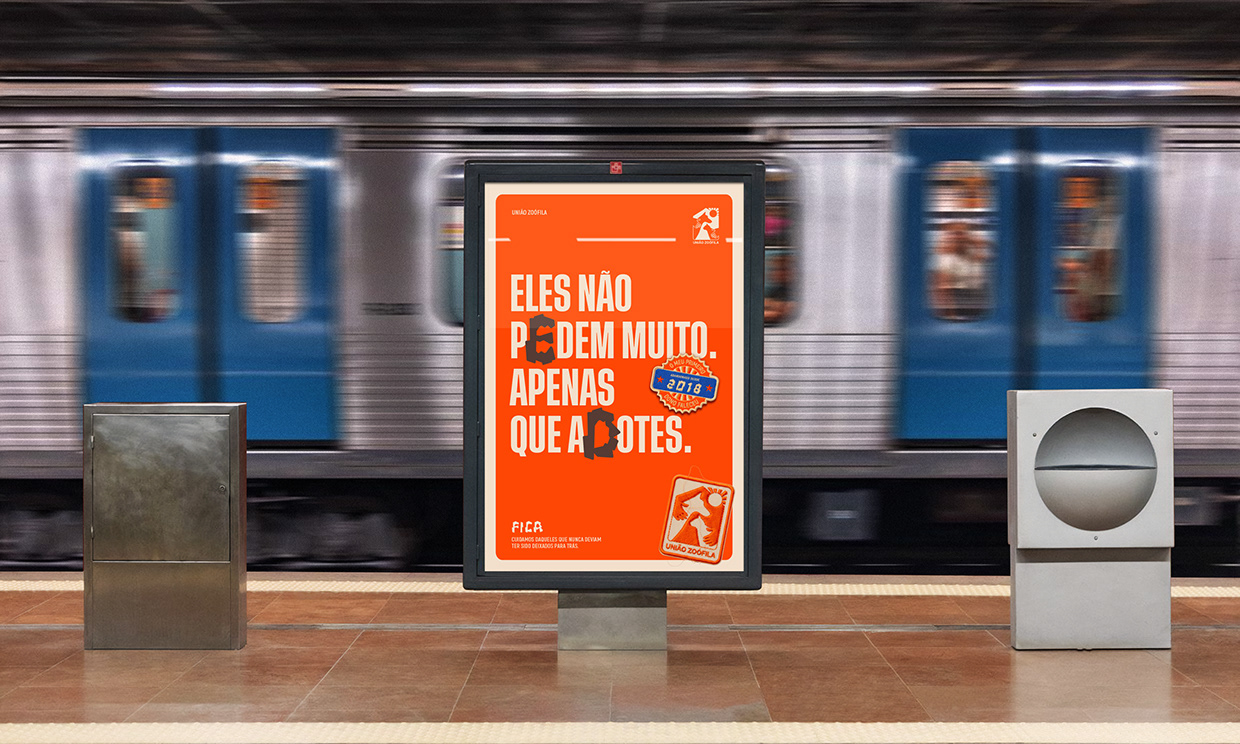
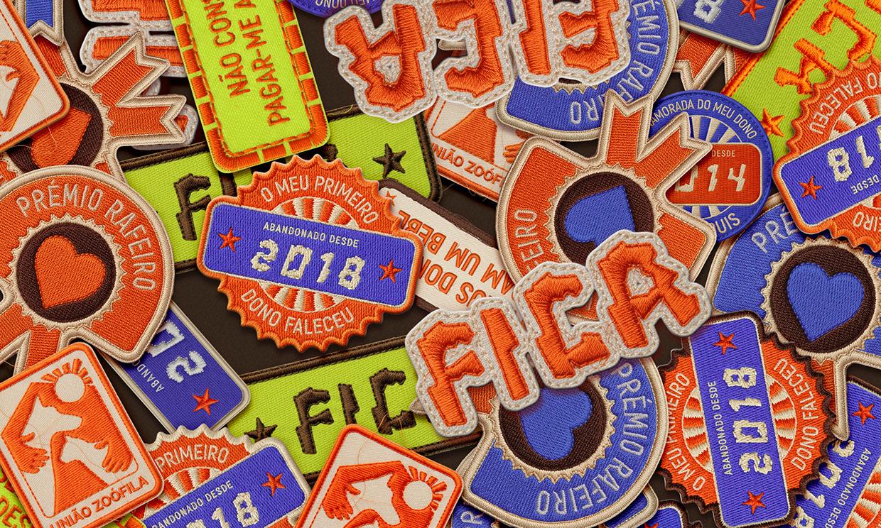
Link: https://www.behance.net/gallery/243550917/Uniao-Zoofila-Rebrand-Identity For over seventy years, União Zoófila has sheltered abandoned animals in Lisbon, yet its visual identity no longer reflected its social impact. The rebrand strategy centered around a single, powerful word, “Fica” (Stay), as both a typographic and emotional anchor. At its core lies Rafeira, a custom typeface inspired by the neighborhoods of Lisbon and the resilience of straight pets. Its irregular letterforms transform imperfection into empathy, creating a visual language of care and permanence. The identity system extends Rafeira’s DNA across motion, print, and digital applications through adaptable grids, modular layouts, and expressive typography. Every element was taken in consideration to reinforce the message of belonging to the community, reinterpreting the act of adoption not as a transaction, but as a lasting commitment, a promise to Stay ("Ficar"). Design: The brief challenged us to transform seventy years of sheltering into a brand of belonging. Through Fica (Stay), adoption shifts from an act of rescue to an act of permanence. Rafeira embodies the imperfect beauty and resilience of mixed-breed animals, while modular grids, symbolic “honour patches,” and a triadic palette translate empathy into a flexible system, embedding care, trust, and community across every touchpoint. In Portuguese, "Fica" carries strong emotional meaning, expressing permanence, loyalty, and shared responsibility. Rafeira’s irregular forms are informed by the 24 freguesias of Lisbon, reinforcing local cultural grounding within the typographic structure. “Honour patches” function as visual scars, confronting the social narratives behind abandonment while reflecting local values of empathy and collective care. Each element embeds cultural truth into a system designed to mirror human behaviour and encourage long-term social responsibility. Results: Launched as a brand awareness initiative and validated by the organisation, the identity demonstrated design as a mobilisation tool. Within 48 hours, the system generated a 76,800% increase in organic reach, with 83% of viewers coming from non-followers, expanding visibility beyond the traditional animal welfare audience. Beyond a visual refresh, the identity provides a scalable communication infrastructure. Typography, grids, patches, and messaging operate as a living system that shifts public perception from rescue to lifelong commitment, mobilises new audiences, and enables consistent, culturally grounded storytelling, supporting long-term behavioural impact and trust. Keywords: Rebranding, visual identity design, social impact branding, contemporary graphic design, typography, motion graphics, print design, digital applications, modular layouts, adaptable grids, emotional branding, Portuguese graphic design, animal welfare identity, purpose-driven design, brand awareness, culturally grounded design.
Support this project
Upvote