Edite typeface
by Typeverything · Nov 2025
web
Project description
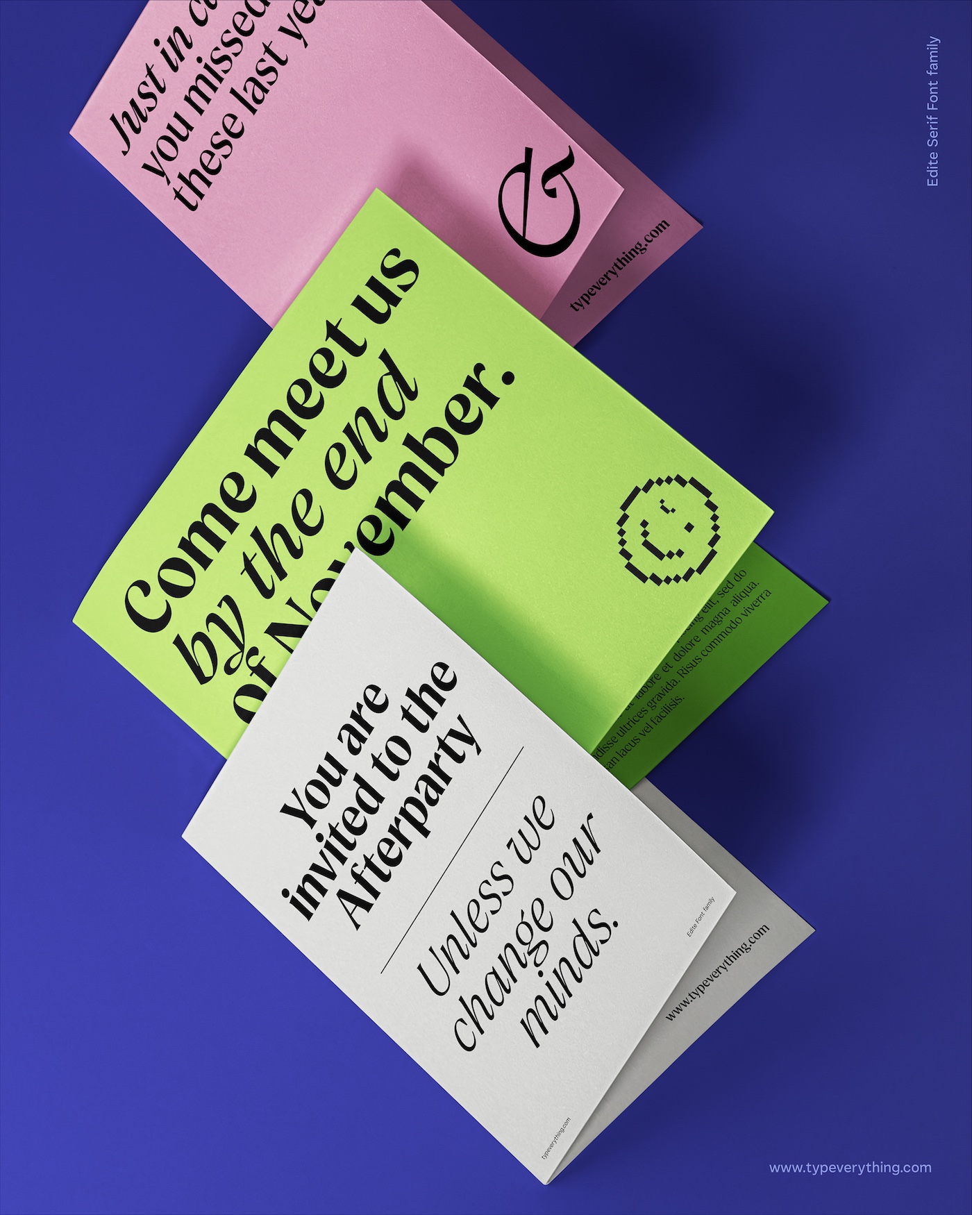
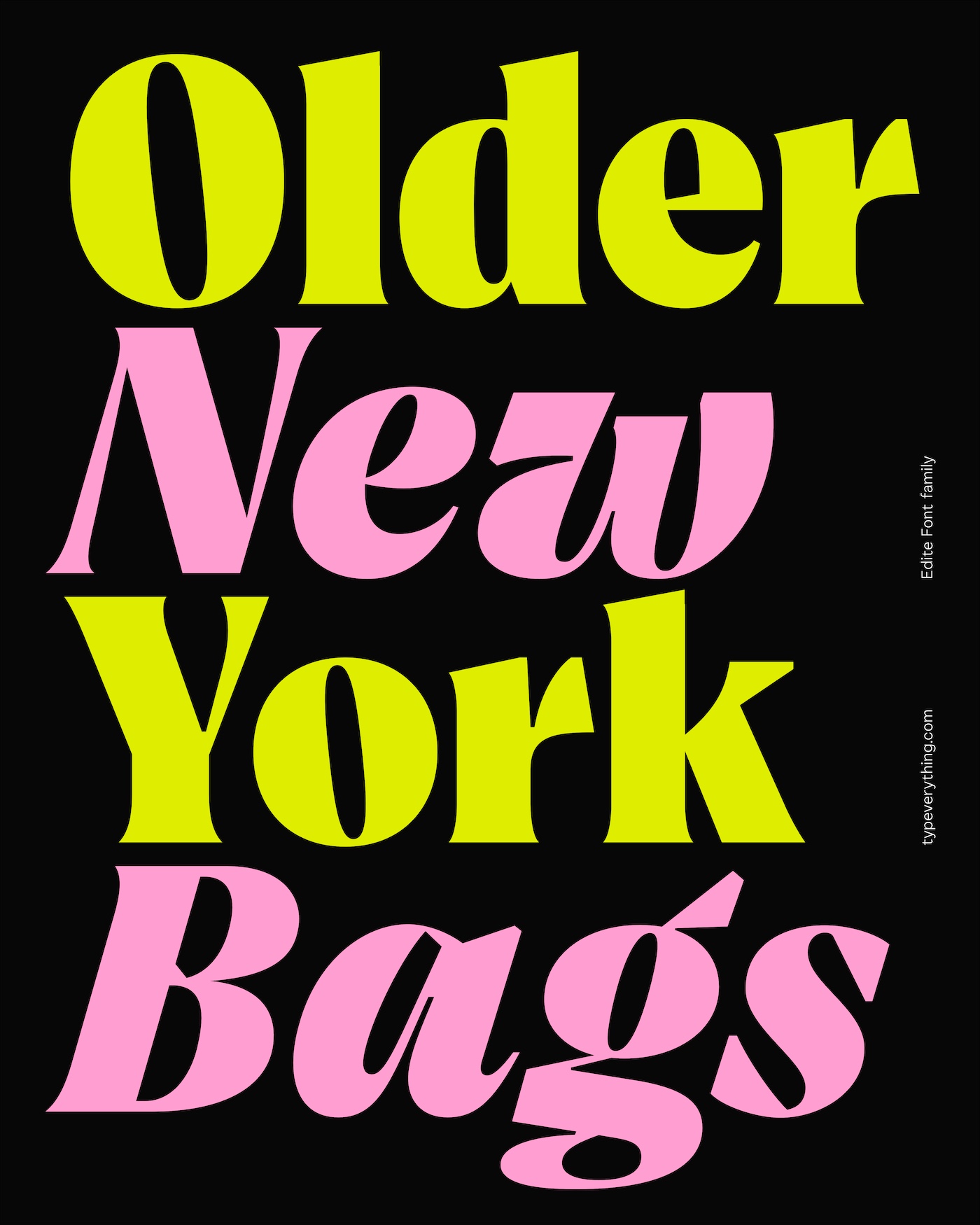
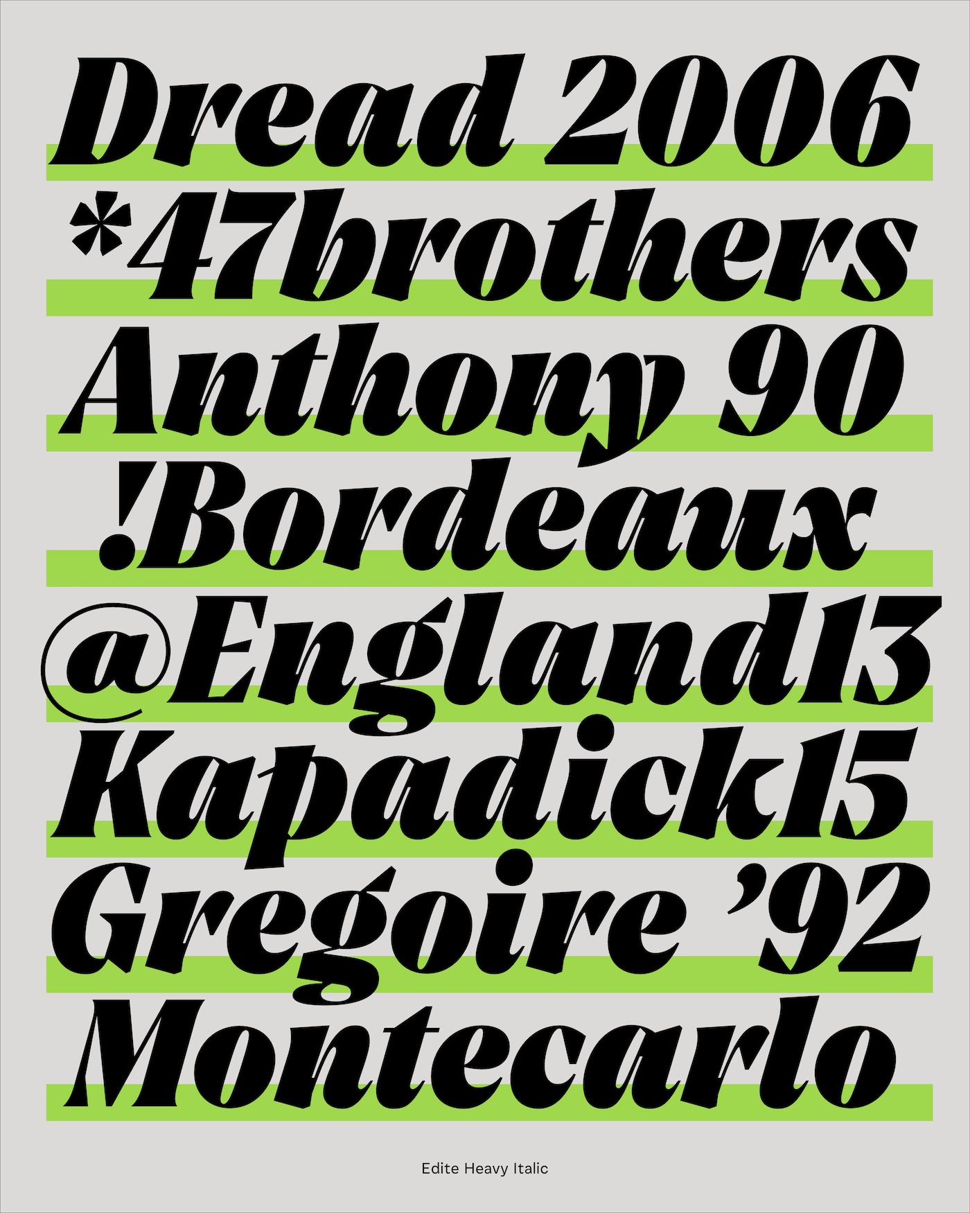
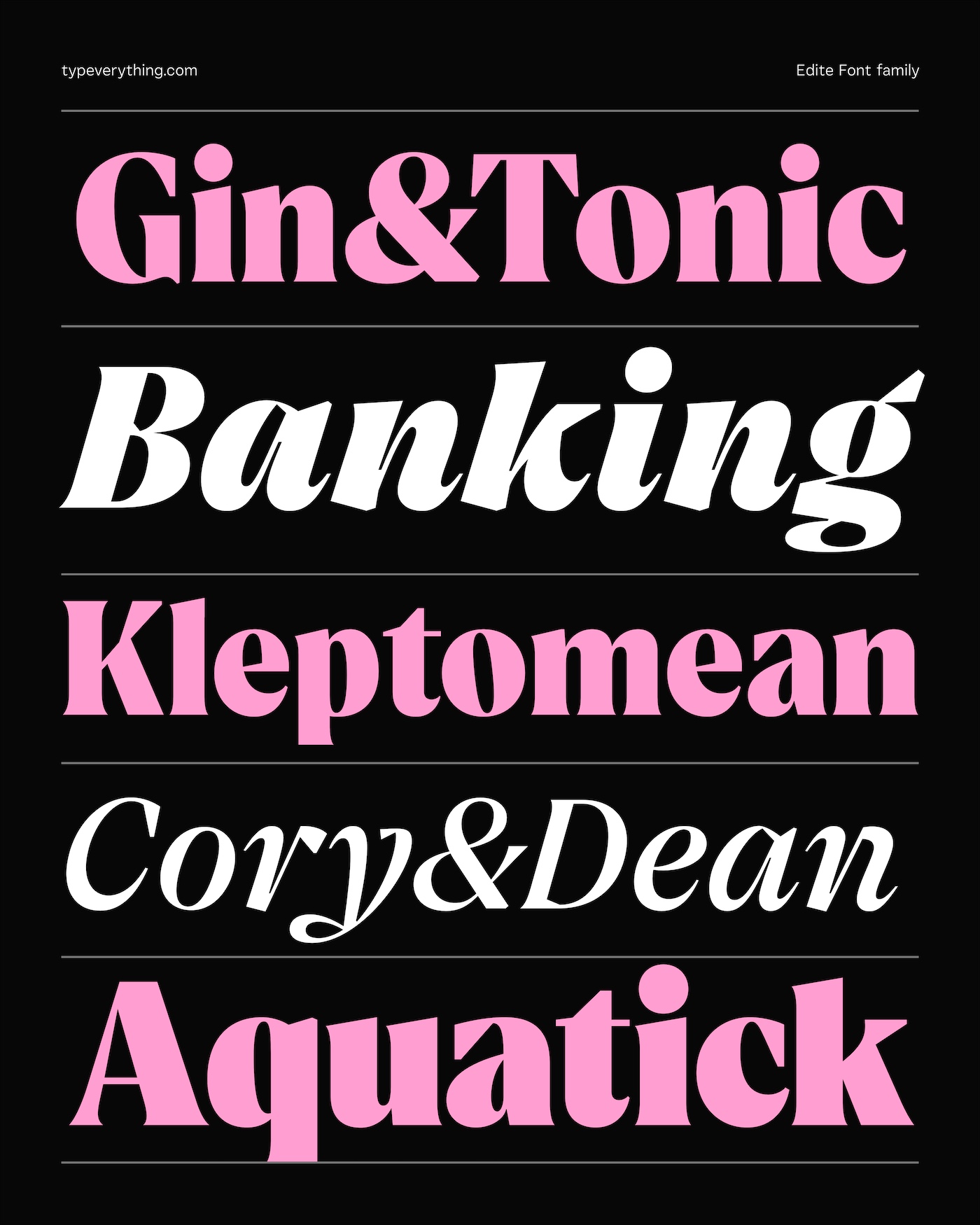
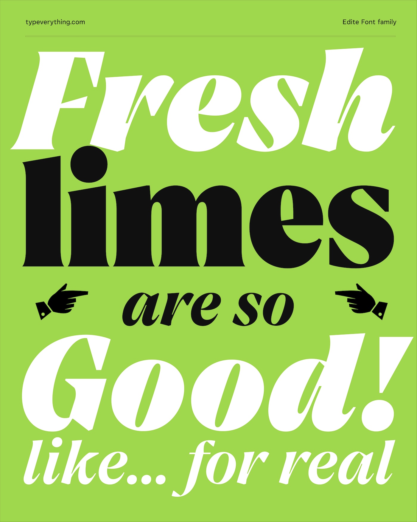
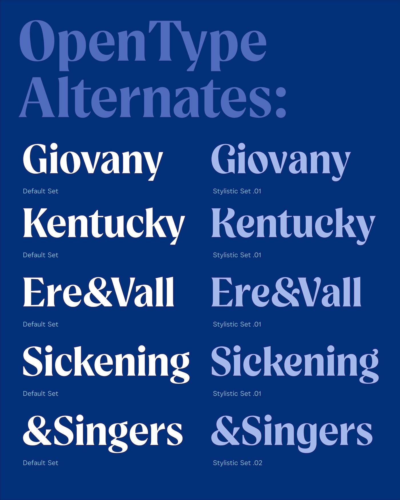
Edite began as an exploration into finding a contemporary De Vinne, the classic 1890s serif originally credited to Gustav Schroeder and later extended by Nicholas Werner. We wanted to keep the spirit of that historic design, while giving it the clarity, geometry, and refinement needed for modern use. The result is a family of 9 weights in Normal and Italic, both with variable files. The Upright includes a set of friendlier alternates, offering more versatility for branding and editorial work. Sharp cuts and subtle angular geometry give Edite its confident tone, making it a solid performer in print, packaging, and visual identity systems. And the Italic, honestly, is chef’s kiss.
Support this project
Upvote