Adsbyjoris - Digital Marketing Agency Website Redesign

Project description
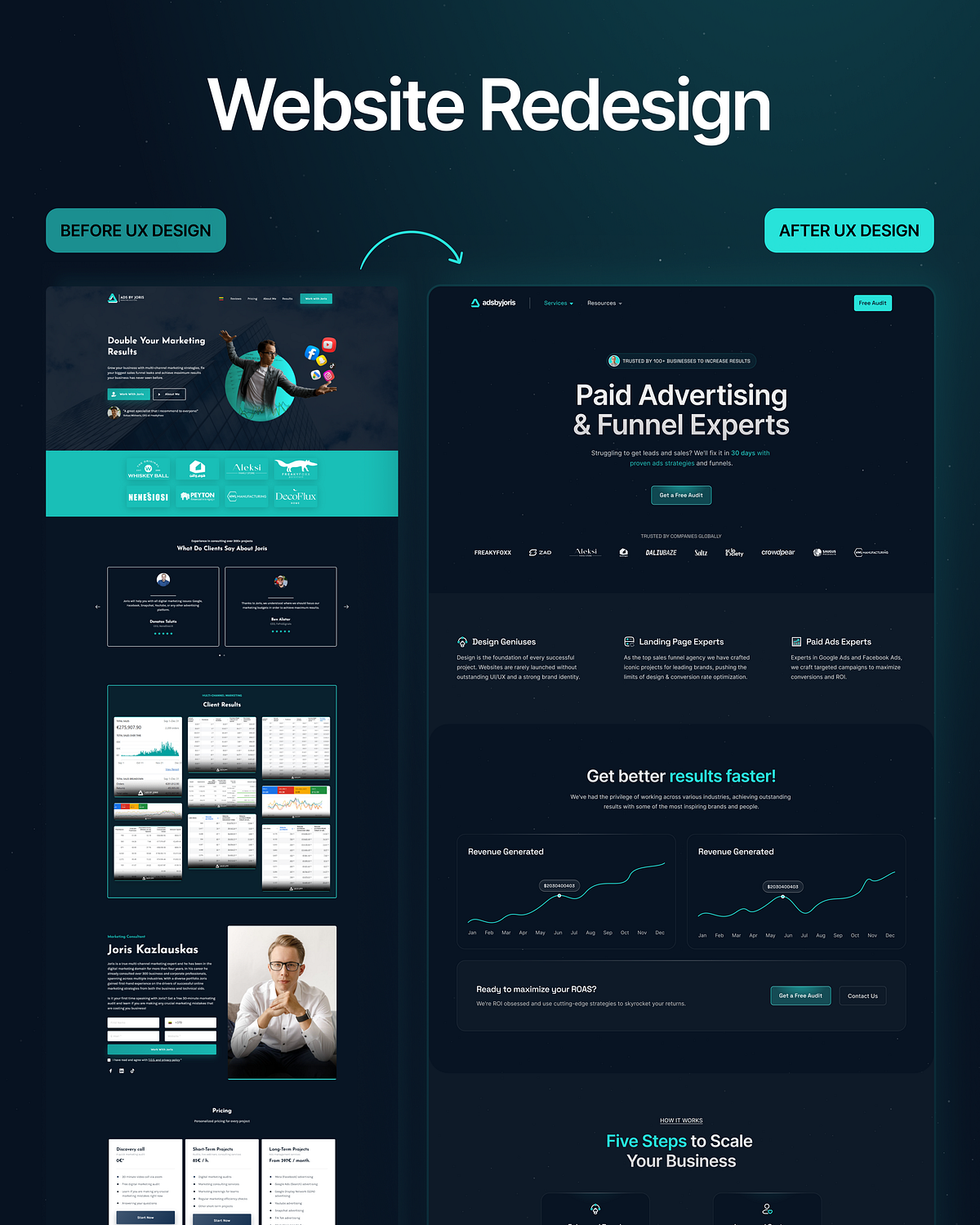
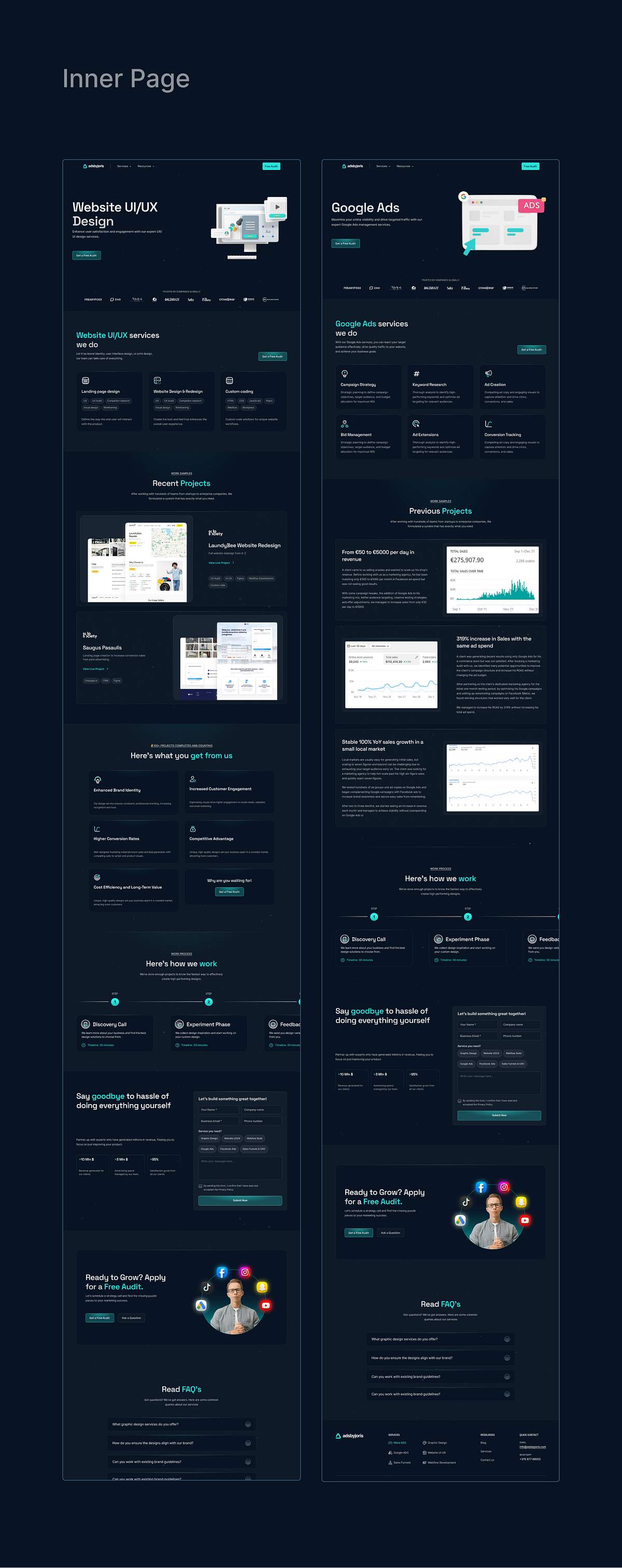
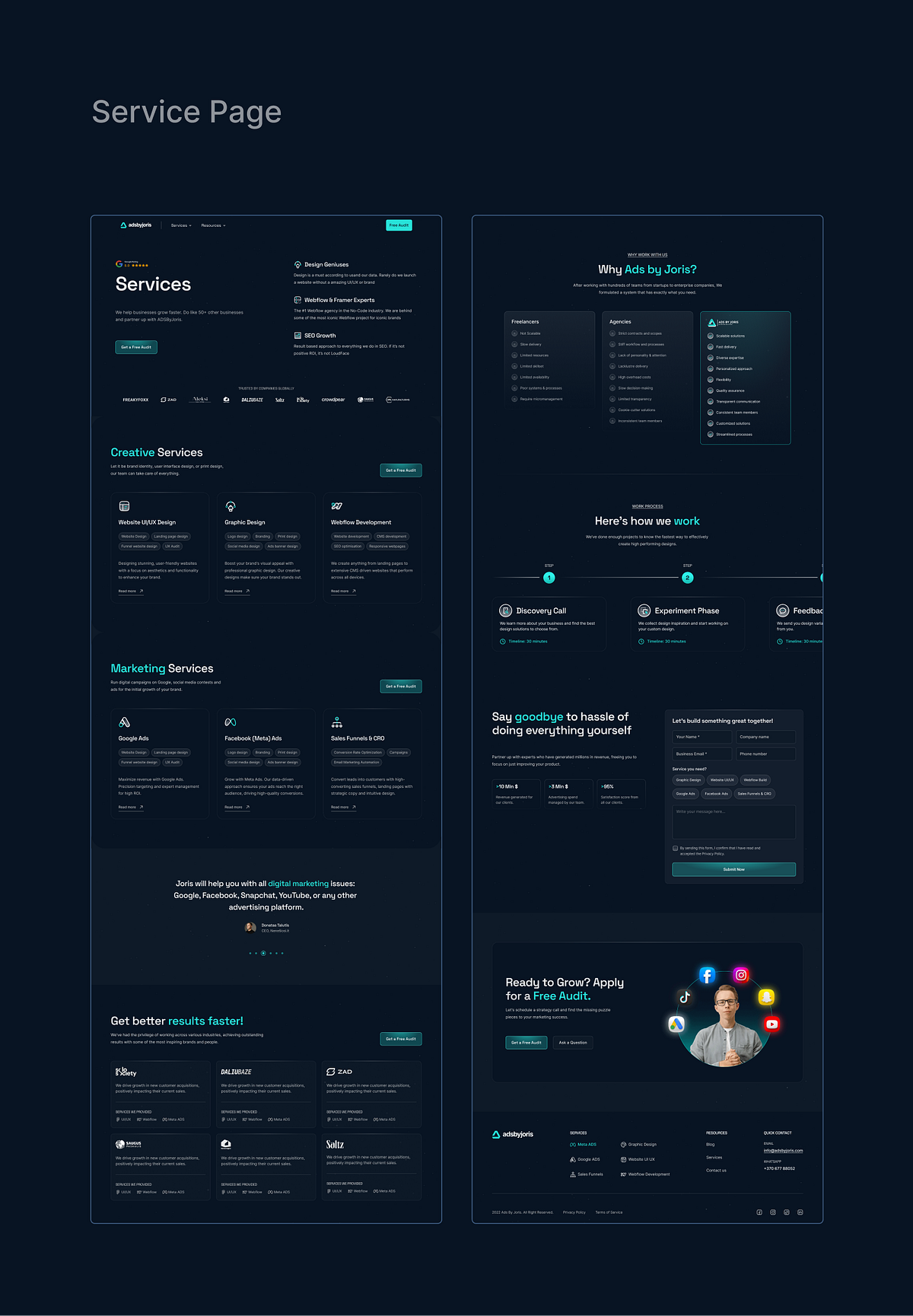
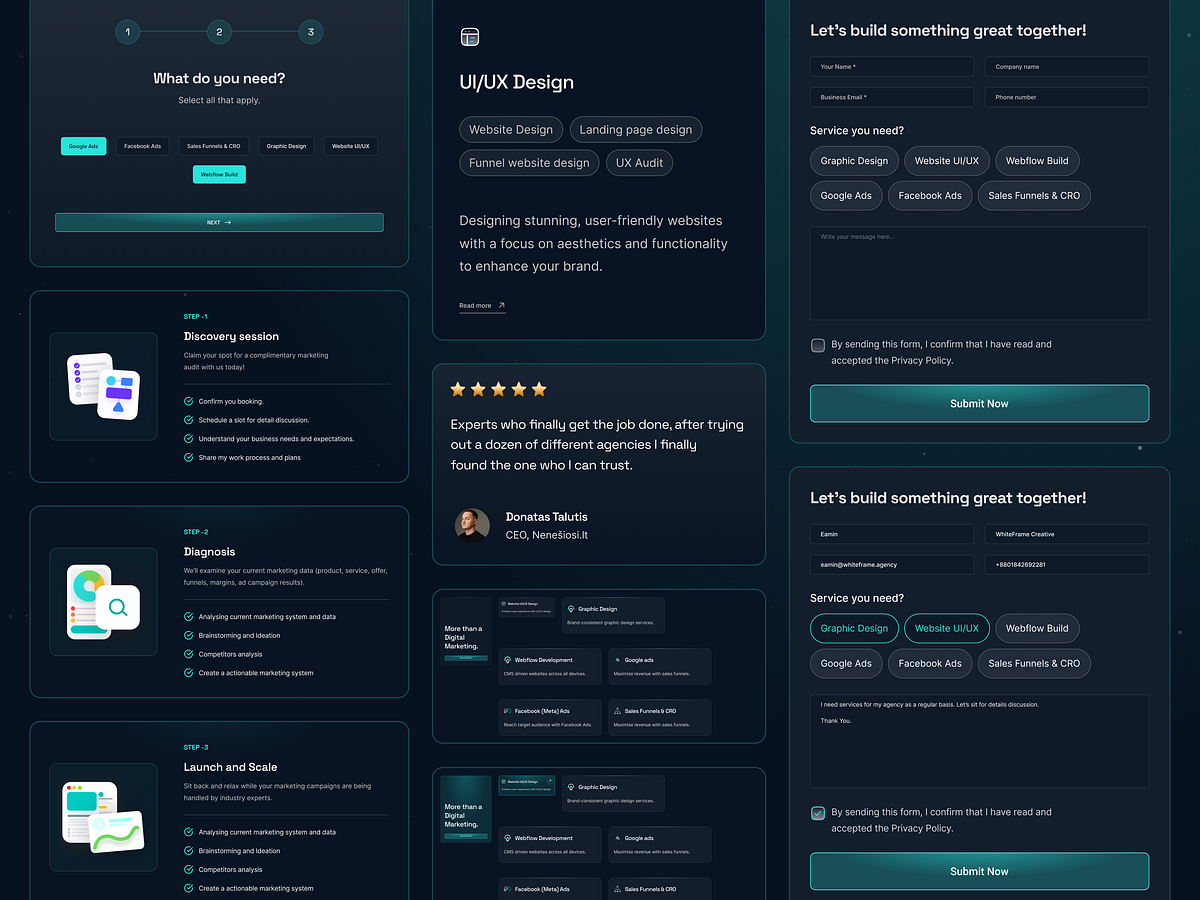
Redesigning a high-performing agency site requires more than just a fresh coat of paint—it requires solving deep-rooted UX problems. Here is the motion case study of how we transformed Adsbyjoris. 🔄 ⚠️ The Problem: The previous website suffered from high bounce rates and a cluttered user journey. Potential clients were getting lost in dense text blocks and unclear navigation, leading to missed leads. 💡 The Insight: Users visiting ad agencies want speed and proof. They don't want to read paragraphs; they want to see results and understand the "how" instantly. ✅ The Solution: We stripped back the noise. Visuals: Replaced stock imagery with custom data-visualization graphics. Structure: Implemented a linear "Problem > Solution > Proof" layout. Motion: Added subtle micro-interactions to keep users engaged without distracting them from the core message. The result is a streamlined, high-converting funnel that reflects the quality of Adsbyjoris's work. Let us know your thoughts on this transformation in the comments! 💬
Support this project
Upvote