Mobile-First Experience: Estalio Responsive Layouts

by WhiteFrame Creative · Feb 2026
shot
Project description
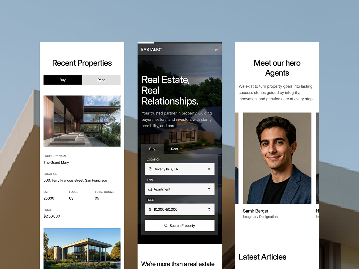
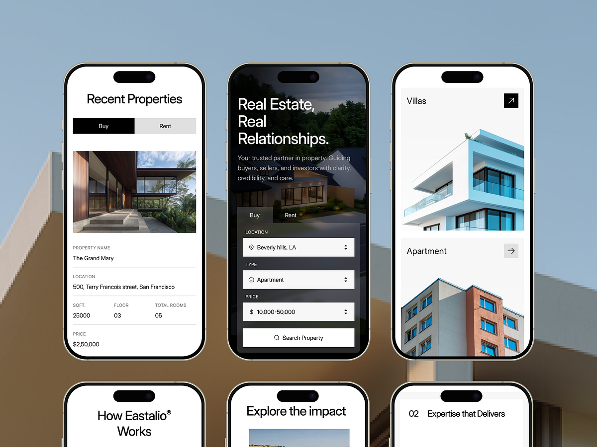
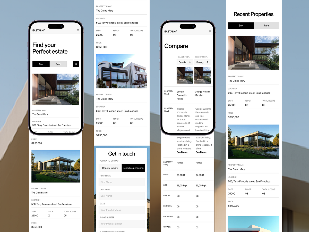
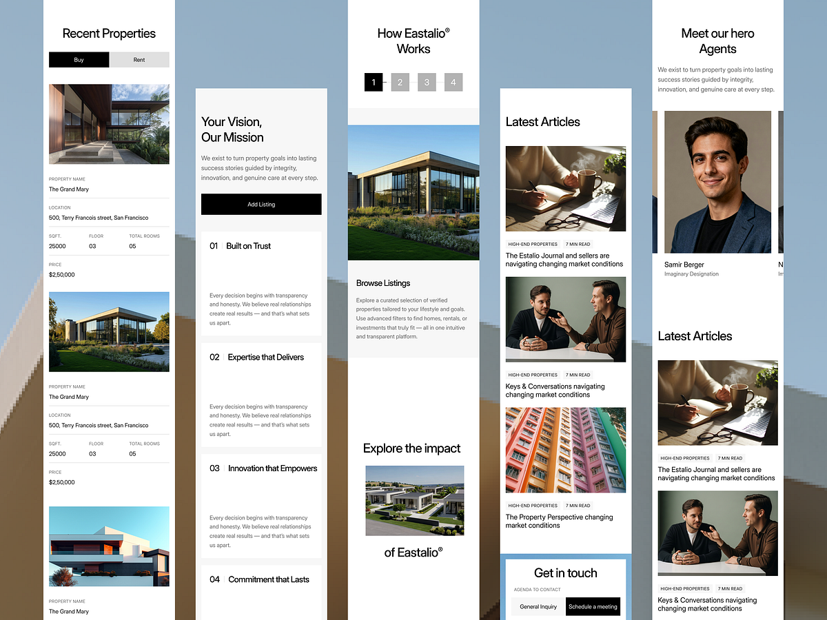
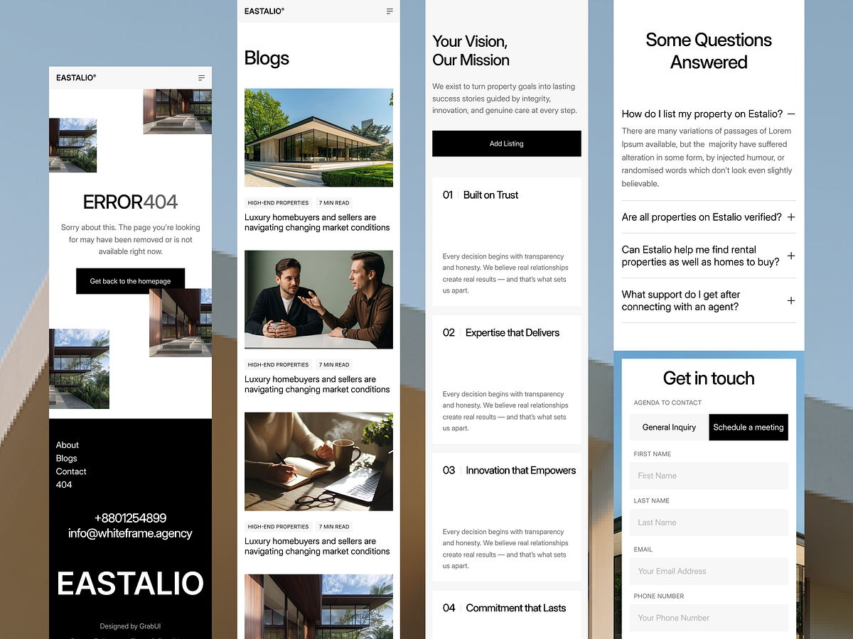
Did you know over 58% of global web traffic comes from mobile devices? We designed Estalio with a mobile-first philosophy to ensure your architecture portfolio looks stunning on any screen size. We didn't just scale down the desktop version; we optimized touch targets, navigation flow, and image loading specifically for tablets and phones. This ensures your potential clients get a seamless experience whether they are in the office or on a job site. Secure your client's trust with a flawless mobile experience. Check our website to grab this template now.

Support this project
Upvote