Analytics dashboards design

Project description
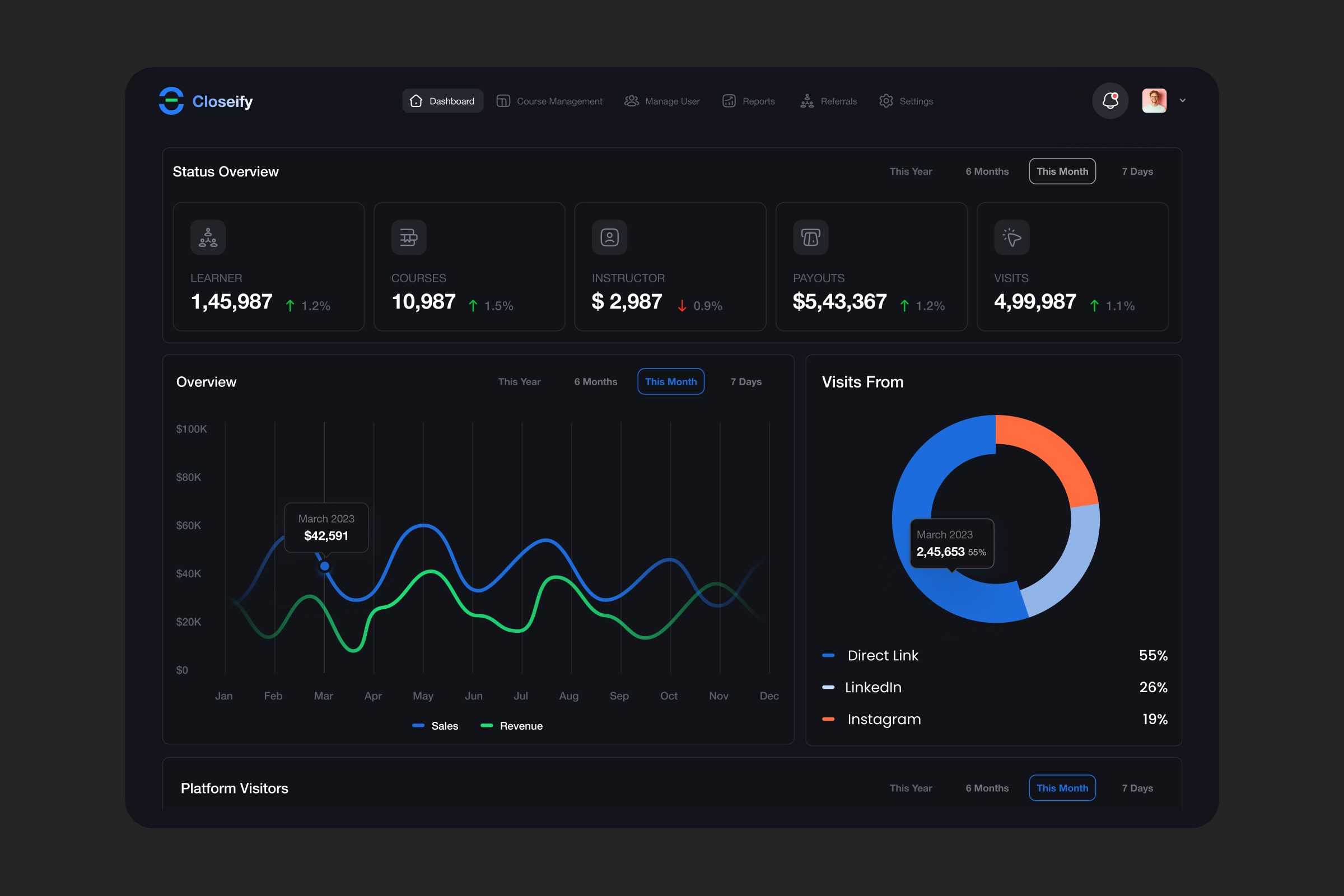
Analytics dashboards without clarity are just noise. When teams can’t instantly understand performance metrics, traffic sources, or growth trends, they end up reacting late instead of making proactive decisions. For this Analytics SaaS Dashboard, the focus was on turning complex data into a clear, real-time decision-making tool. Where many analytics dashboards fall short - Too much data with no clear prioritization - Metrics displayed without actionable context - Poor visual hierarchy that slows down scanning - Disconnected insights across charts and widgets What we did differently This design organizes key metrics like learners, courses, revenue, and visits into a structured overview, giving instant clarity at the top level. Interactive charts provide trend visibility over time, while the traffic source breakdown (Direct, LinkedIn, Instagram) adds context to performance. The dark UI enhances focus, reduces visual fatigue, and highlights data through contrast. Every element is designed to help users understand “what’s happening” and “what to do next” without friction. Outcomes delivered - Faster insight discovery with clear data hierarchy - Better decision-making through contextual visualization - Reduced cognitive load with structured layout - Improved focus with a clean, dark interface Because dashboards shouldn’t just display data — they should drive decisions. Open to feedback and collaboration 🤝 📩 josim.design@gmail.com
Support this project
Upvote