Lead Generation SaaS Website — Designed to Build Trust Before Conversion

Project description
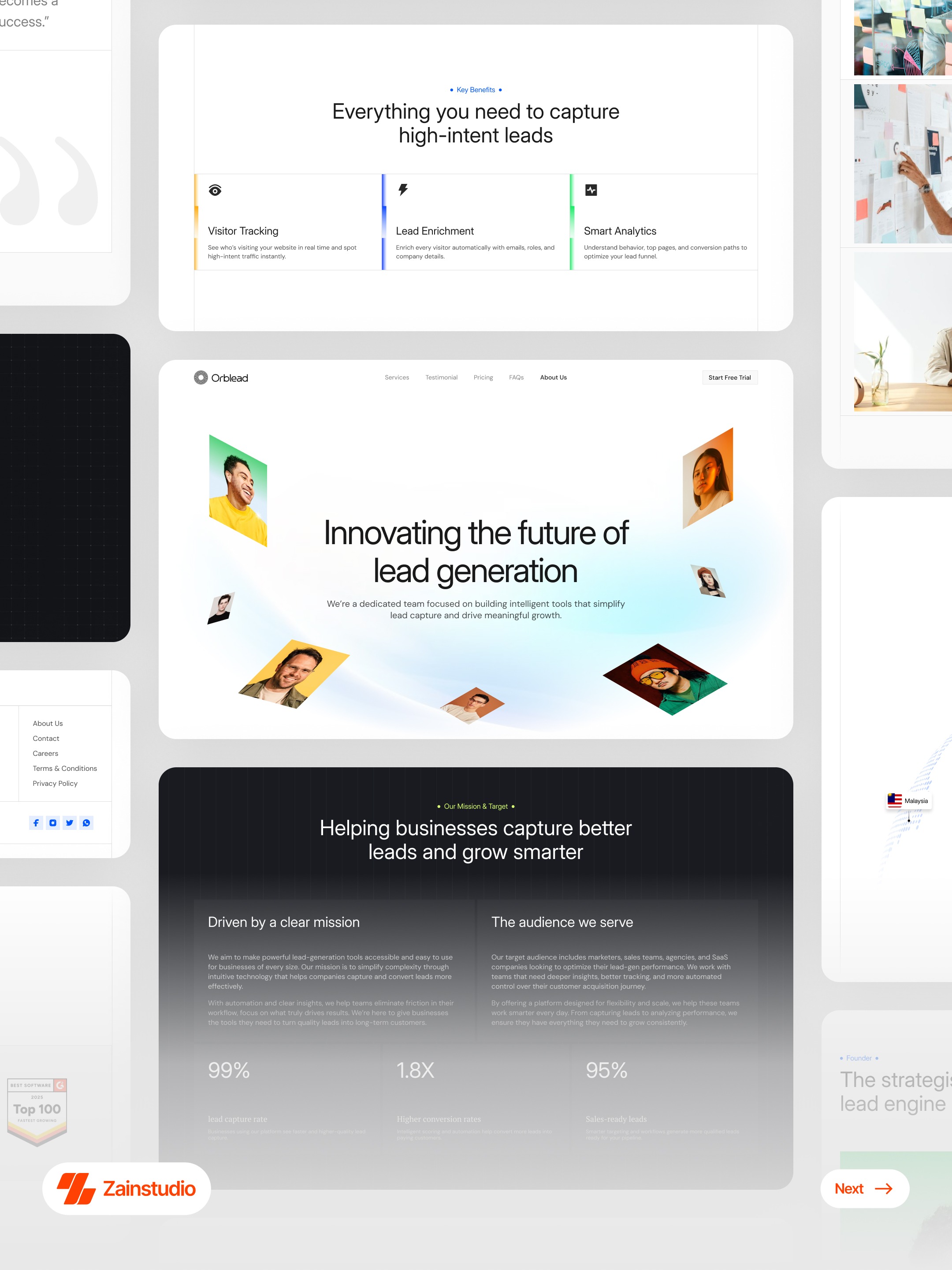
If a visitor lands here for the first time… would they understand, trust, and take action? That’s the problem this design is solving. Most SaaS websites push users to sign up too quickly. But users don’t convert until they understand the value and feel confident. So this experience is structured as a guided journey: 1. First impression → Clarity A clear, outcome-driven message explains what the product does and why it matters within seconds. 2. Understanding → Value Feature sections break down the system (tracking, enrichment, analytics) in a simple, scannable way — no technical overload. 3. Exploration → Education Guides and content sections help users learn, compare, and build confidence before making a decision. 4. Trust → Proof Founder story, testimonials, and achievements create a human connection and reduce hesitation. 5. Decision → Action Strategic CTAs appear only after users have enough context — making conversion feel natural, not forced. Why this matters for businesses: → Higher-quality leads (users understand before signing up) → Better conversion rates (trust reduces friction) → Stronger brand perception (education + transparency) Outcome: A website that doesn’t just attract traffic — it guides users step-by-step toward confident decisions. If you're building SaaS products that need real growth, not just clicks: 📩 josim.design@gmail.com
Support this project
Upvote