Afimra Landing Page Hero Exploration

Project description
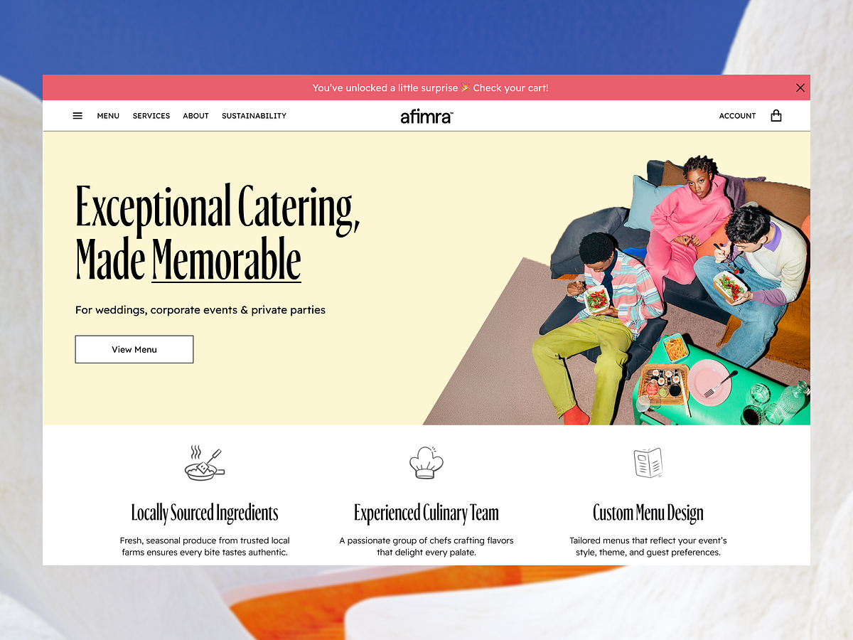
Afimra Website Landing Page Hero This concept focuses on presenting product value with clarity and confidence. For Afimra, the hero section was designed to quickly communicate purpose while guiding users toward meaningful interaction.The layout emphasizes structured content and visual balance, allowing key messages to stand out without distraction. Typography is organized for fast scanning, while spacing creates a calm rhythm across the page. Subtle motion adds depth, helping users move naturally through the experience.Rather than relying on heavy visuals, this exploration prioritizes product positioning and message clarity—ensuring users understand what Afimra offers within seconds of landing.Key Design Highlights→ Clear product positioning from the first screen→ Structured hierarchy for quick comprehension→ Balanced layout supporting visual focus→ Minimal UI to reduce distraction→ CTA placed within natural reading flow→ Designed with user understanding in mindAt Moobliy, we design SaaS experiences that prioritize growth—helping products increase conversion rates, improve activation, and support long-term scalability through thoughtful UI/UX design.We provide:– UI & UX Design– Mobile App Design– SaaS Landing Pages– UX Audit & Conversion Optimization– Web Design & Development– Brand Identity for Digital ProductsHave a product to scale?Click on “Get in touch”
Support this project
Upvote