Angel Rides Landing Page Hero Exploration

Project description
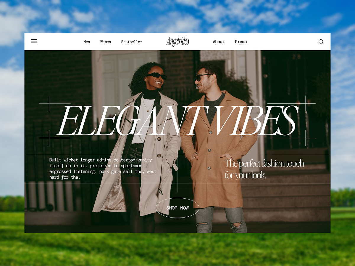
Angel Rides Website Hero This concept explores how a landing page can communicate trust, motion, and reliability at first glance. For Angel Rides, the goal wasn’t just to present a service, but to create confidence before the first click. The hero section is built around clarity and flow. A structured layout guides the eye naturally from message to action, while the visual elements reinforce speed, safety, and accessibility. The design stays minimal, but the intent is strong, nothing feels accidental. Typography is clean and purposeful, allowing the message to stand without distraction. Space is used deliberately to keep the experience breathable, while contrast ensures key elements remain instantly recognizable. The result is a hero that feels calm, professional, and ready to move. This layout focuses on usability first, ensuring users understand what Angel Rides offers within seconds. Key Design Highlights → Clear, confidence-driven headline to establish trust → Balanced layout that guides attention naturally → Minimal UI to reduce friction and improve clarity → Strong contrast for instant readability → Focused CTA placement for quick action → Designed with real user flow and accessibility in mind #webdesign #uiux #landingpage #website #uxdesign #uidesign #digitalproduct #minimaldesign #herosection
Support this project
Upvote